What Is Data Visualization and How to Visualize Data: a Comprehensive Guide

Data visualization is a powerful method that transforms complex data into meaningful insights, making it easier for both individuals and organizations to comprehend. By using visual elements like charts, plots, infographics, and animations, data visualization simplifies intricate relationships and patterns that might otherwise be difficult to interpret. It allows users to grasp trends, correlations, and key insights quickly, enhancing decision-making and enabling a deeper understanding of underlying data. Whether in business, healthcare, or scientific research, data visualization empowers users to draw informed conclusions and make data-driven decisions efficiently.
What Is Data Visualization?
Data visualization refers to the graphical representation of data, using various visuals to communicate information clearly and effectively. It encompasses a wide range of techniques, from static charts to interactive dashboards, all designed to make data more accessible and interpretable. It goes beyond mere presentation by helping to uncover hidden patterns, relationships, and trends within data. Data visualization serves multiple purposes, such as generating ideas, illustrating concepts, facilitating visual discovery, and supporting everyday data-driven tasks. This versatility makes it an invaluable tool for both data professionals and decision-makers across different fields.
How to Visualize Data
Traditional data visualization tools like Excel, Tableau, and Power BI require considerable expertise and manual effort to create effective visualizations. Users need to input raw data, clean and organize it, and then select the appropriate visualization types, often customizing them to ensure clarity. This process can be particularly time-consuming and intricate, especially when working with large datasets. Advanced skills are often necessary to fully utilize these tools, as tasks like building interactive dashboards or performing complex calculations may require knowledge of formulas, scripting, or even programming languages. While these tools are powerful, they demand significant time investment and a solid understanding of data analysis techniques.
With AI, data visualization is undergoing a transformative shift, automating many of these complex and time-consuming processes. AI-driven tools can automatically clean data, identify patterns, and suggest the most effective visualizations, streamlining the entire workflow. This not only reduces the manual effort involved but also empowers users—whether data scientists, business managers, or non-technical professionals—to generate insightful visualizations quickly and with ease. AI makes it possible to create dynamic, real-time visualizations that adjust as new data is added, offering an intuitive and responsive user experience. By removing the need for expert-level skills, AI democratizes access to sophisticated data analysis, making it easier for everyone to harness the power of their data.
In this blog, we'll demonstrate how to use Powerdrill AI, an AI-driven data analysis platform, to automate data visualization and save you a significant amount of time. With Powerdrill's powerful AI capabilities, you can quickly turn complex data into clear, actionable insights—without the need for manual effort or expert-level skills.
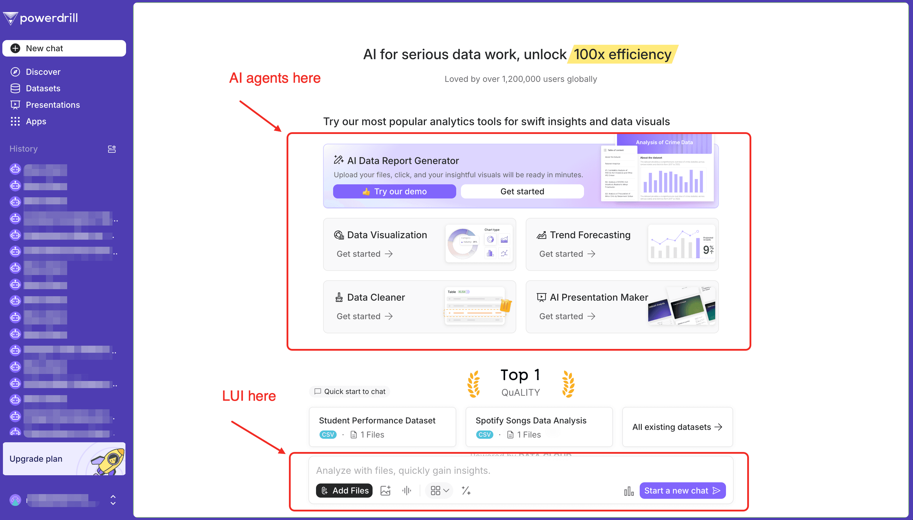
Automate Data Visualization with Powerdrill AI
Powerdrill AI offers a range of powerful tools to streamline the data visualization process, making it easier and more efficient. These include:
An AI agent called Data Visualization: This tool simplifies your data visualization by providing a two-step workflow, allowing you to generate effective visualizations with minimal effort.
Global LUI (Language User Interface): Leveraging the power of Powerdrill, the Global LUI enables you to ask specific questions about your data. Powerdrill then analyzes the data and visualizes insights, patterns, and trends related to your query, offering a valuable supplement for more in-depth answers.
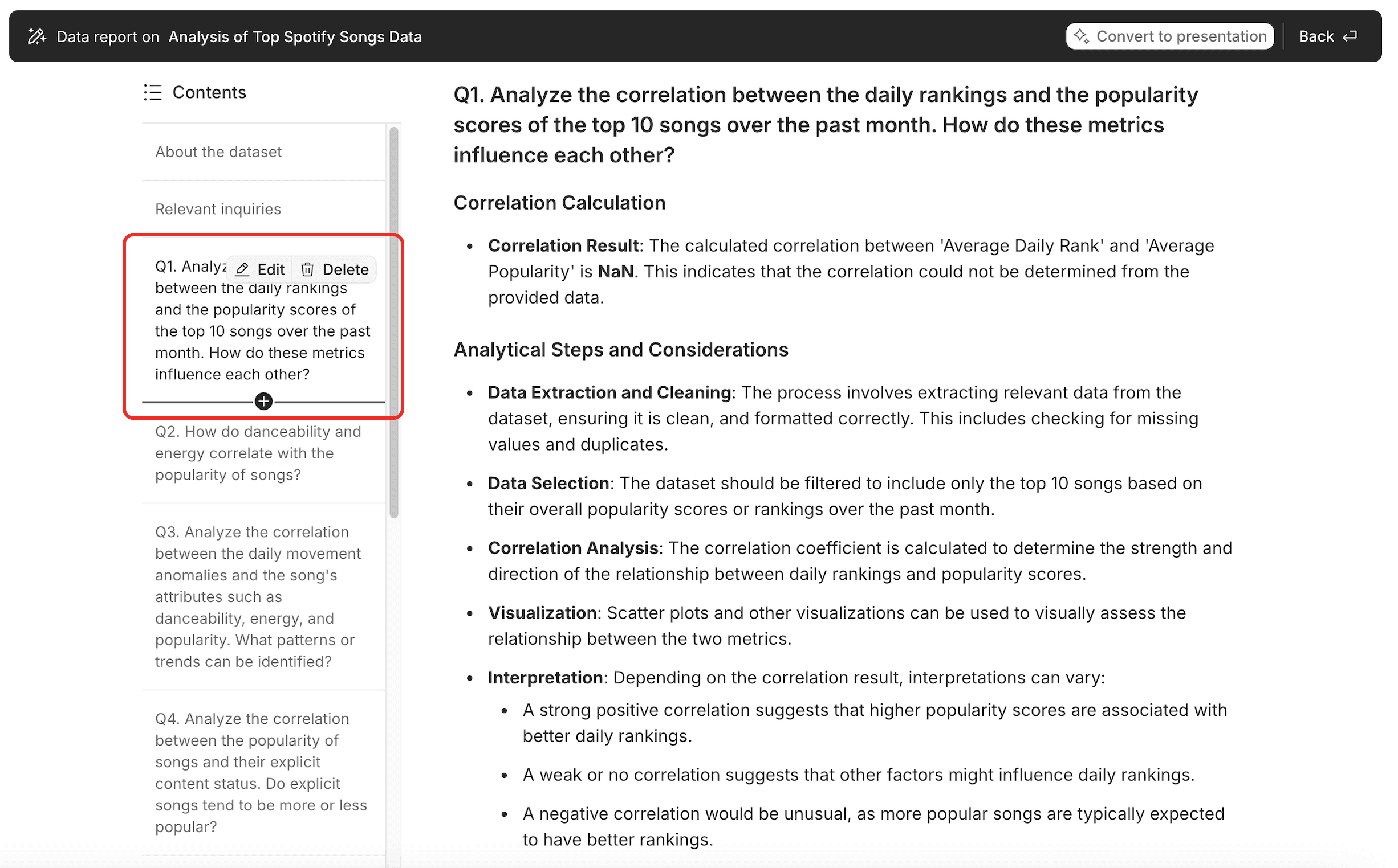
An AI agent called AI Data Report Generator: This agent creates comprehensive data reports containing ten Q&As, each paired with a visual, a detailed answer, and insightful analysis. If you're not satisfied with any of the responses, you can easily rewrite the question to regenerate the answer. And this is used in the example later discussed in this blog.
An AI agent called AI Presentation Maker: This tool takes your data files and automatically generates presentation slides, incorporating data visuals and insights uncovered from your data. It turns your complex data into clear, impactful slides ready for presentation.
An Example: Visualize Data in One Click with AI Data Report Generator
In the following example, we uses Powerdrill's AI Data Report Generator to describe how to convert your data files into a stunning and impressive data report in one click.
The sample data we use in this blog is "Top_spotify_songs.csv", downloaded from Kaggle.
This dataset presents the top songs currently trending for over 70 countries.
Step 1. Log in to Powerdrill
Log in to Powerdrill, and click "Get started" in the "AI Data Report Generator" card.
If you don't have a suitable dataset on hand, no worries! Simply click on "Try our demo" to access the demo dataset provided by Powerdrill.
Step 2. Upload your file
Choose the files you want to analyze from your device. Ensure the files are CSV/TSV/Excel files. Up to 10 files can be uploaded at a time.
Step 3. Customize and Get Your Data Report
After you upload your files, Powerdrill will immediately start analyzing your data and then outputing a data report. This whole process will be completed in just a couple of minutes. Then, your data report will be ready to take away.
Here are two Q&As I extracted from the data report just for you to have a quick glance.
How do danceability and energy correlate with the popularity of songs?
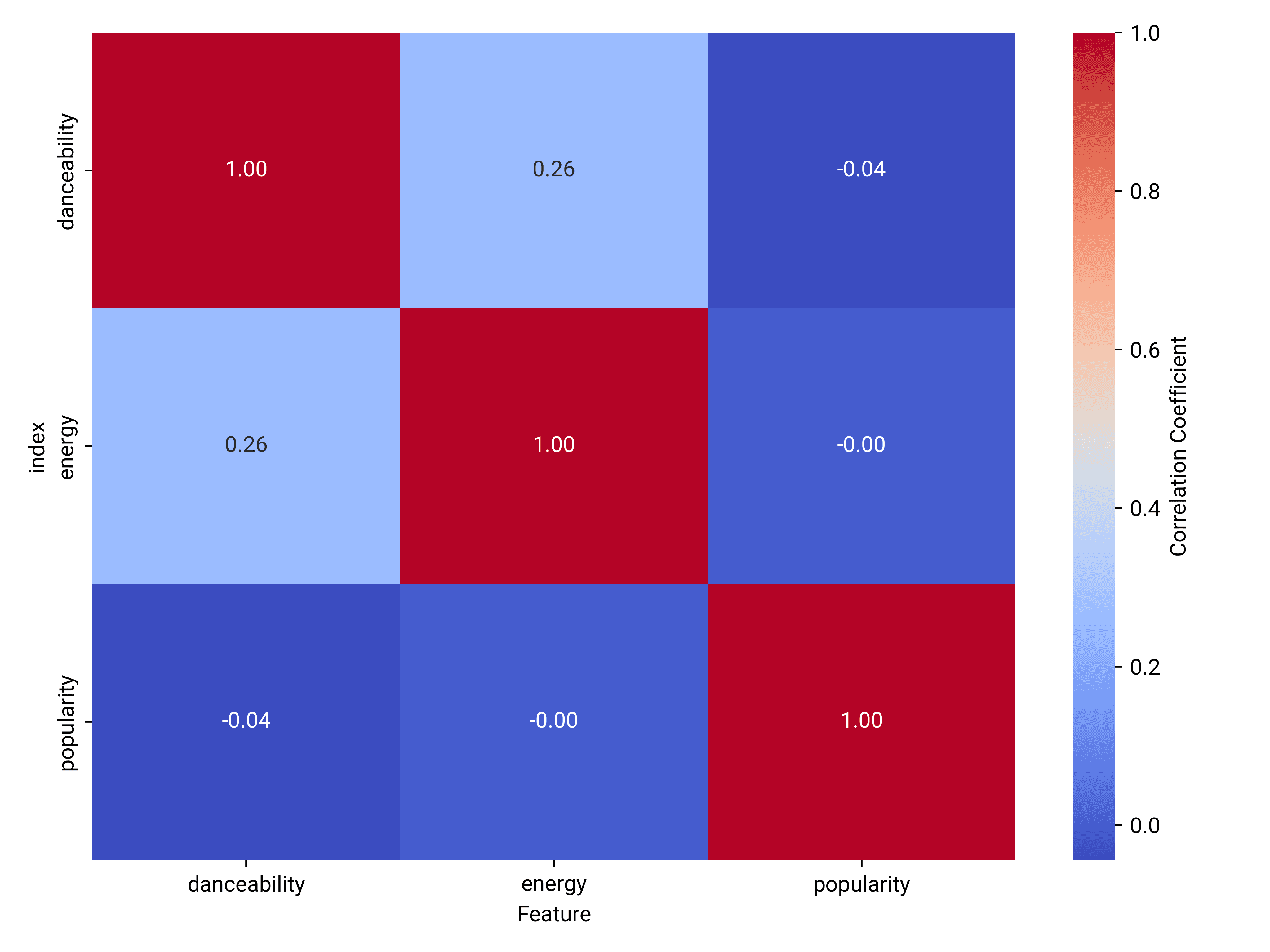
Correlation Coefficients
Danceability and Popularity: The correlation coefficient is -0.04, indicating a very weak negative correlation. This suggests that danceability has little to no impact on the popularity of songs.
Energy and Popularity: The correlation coefficient is -0.00, showing no significant correlation. Energy does not appear to influence song popularity.
Visualization Insights: The heatmap visually confirms the weak correlations. The colors indicate that both danceability and energy have minimal impact on popularity, as shown by the near-zero correlation coefficients.
Conclusion and Insights
Minimal Influence: Both danceability and energy show negligible correlation with the popularity of songs, suggesting other factors might be more influential in determining a song's popularity.
Further Exploration: It may be beneficial to explore other attributes or external factors, such as genre or cultural trends, to better understand what drives song popularity.
Analyze the correlation between the daily movement anomalies and the song's attributes such as danceability, energy, and popularity. What patterns or trends can be identified?
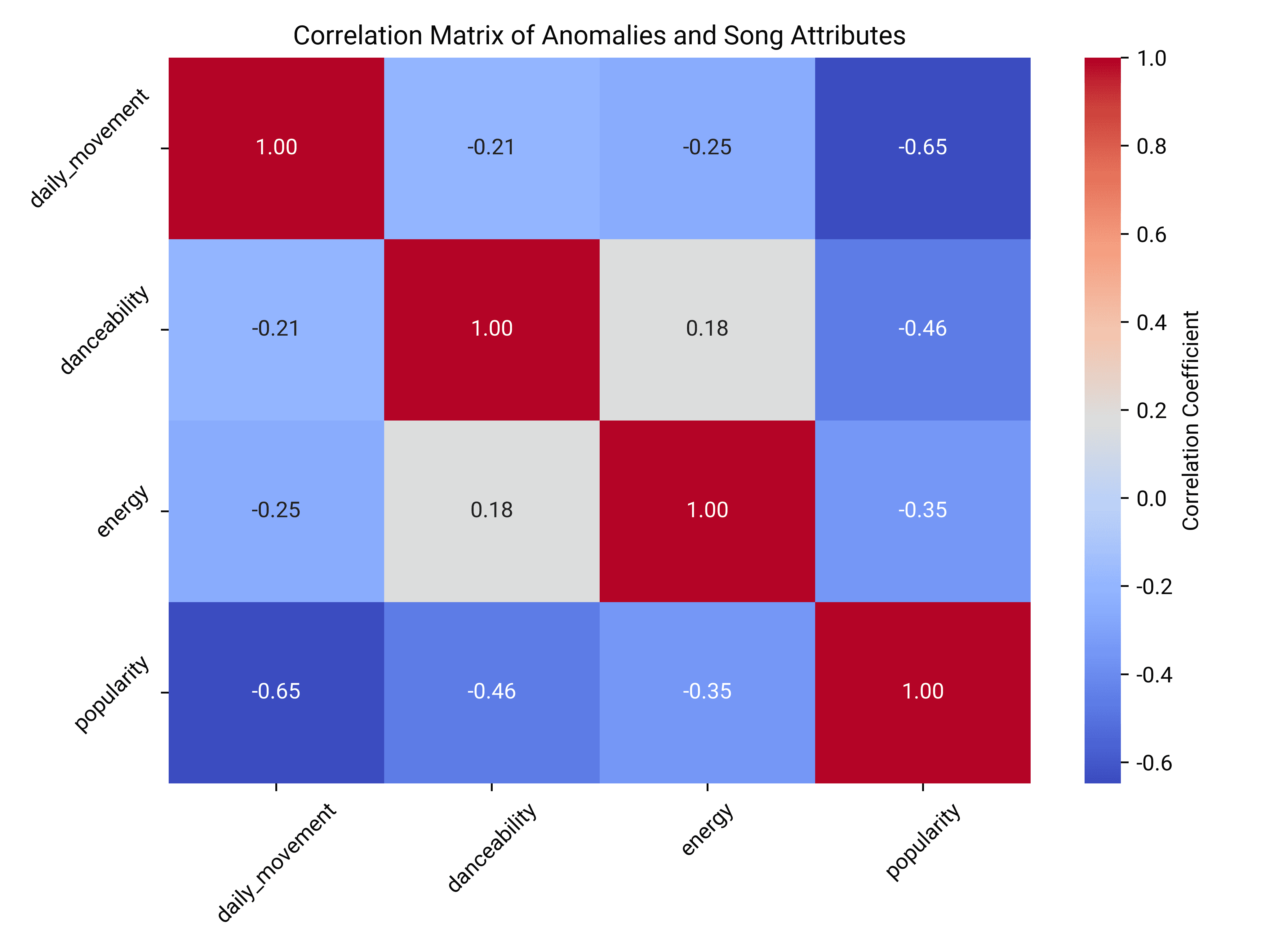
Statistical Correlation
Daily Movement and Popularity: There is a moderate negative correlation (-0.22) between daily movement anomalies and popularity, suggesting that more popular songs tend to have less volatile daily movements.
Daily Movement and Danceability/Energy: The correlations with danceability (0.03) and energy (0.03) are very weak, indicating little to no linear relationship between these attributes and daily movement anomalies.
Visualization Insights
Correlation Matrix: The matrix highlights a stronger negative correlation between daily movement and popularity (-0.65) compared to other attributes. This reinforces the idea that popularity is inversely related to daily movement anomalies.
Danceability and Energy: Both attributes show weak correlations with daily movement, suggesting they do not significantly influence the volatility of song rankings.
Conclusion and Insights
Popularity's Stabilizing Effect: Popularity appears to stabilize daily movements, possibly due to a consistent listener base.
Limited Impact of Danceability and Energy: These attributes do not show significant influence on daily movement anomalies, indicating other factors might be at play in determining song volatility.
If any Q&A in the data report doesn't meet your needs, you can easily edit the question from the left contents menu.
Feel free to explore the other AI agents and the global LUI—they're equally impressive. Powerdrill offers a generous free trial tier, allowing you to experience the full potential of AI in data visualization and see how it transforms your workflow.
A Round-Up
AI is undeniably revolutionizing every field, transforming the way we work and live by automating complex tasks, uncovering hidden insights, and enabling smarter decision-making. From streamlining workflows to enhancing data analysis, AI is making previously challenging processes more accessible and efficient. In the realm of data visualization, AI is especially impactful, simplifying the creation of insightful, interactive graphics and eliminating the need for expert-level skills. To stay ahead in today’s fast-paced, data-driven world, it’s essential to leverage AI-powered tools like Powerdrill. Powerdrill’s AI-driven capabilities empower you to effortlessly visualize your data, uncover hidden trends, and make informed decisions in real-time. Unlock the full potential of your data—start using Powerdrill AI to revolutionize your data visualization experience today!