10 Best Google Data Studio Alternatives in 2026 (Ranked for 2026)
Today, businesses rely heavily on business intelligence tools to visualize metrics, track performance, and uncover hidden trends that drive growth. For a long time, marketers, data analysts, and project managers have defaulted to standard, familiar reporting solutions to build their foundational dashboards. However, as data complexity continues to grow and artificial intelligence drastically revolutionizes daily workflows, static dashboards are no longer sufficient. Companies are actively seeking robust, intelligent, and highly versatile platforms that go far beyond basic charting and graphing.
Modern teams require solutions that provide deep machine learning integrations, advanced enterprise governance, highly interactive user experiences, and seamless multi-source integrations. Simply plotting numbers on a graph is no longer enough; professionals need tools that can analyze, interpret, and execute tasks based on those numbers. Finding the right analytics tool is crucial for staying competitive, optimizing workflows, and empowering your team to extract actual value from your raw data.
What Is Google Data Studio
Google Data Studio (now officially rebranded as Looker Studio) is a widely used data visualization and reporting platform.
Data Visualization: It transforms raw data into customizable, interactive dashboards and easy-to-read reports.
Google Ecosystem Integration: It offers native, seamless connections to Google’s suite of tools, including Google Analytics, Google Ads, Search Console, and Google Sheets.
Free Accessibility: The standard version is available for free, making it a popular starting point for freelancers, small businesses, and individual marketers.
Drag-and-Drop Interface: It features an intuitive canvas where users can drag and drop charts, tables, and scorecards to build visual representations of their metrics.
Collaborative Capabilities: Similar to Google Docs, it allows multiple users to view, edit, and collaborate on a single report in real-time.
Why Look for a Google Data Studio Alternative
While popular, Google Data Studio has several limitations that push growing businesses to seek more advanced alternatives.
Performance and Speed Issues: When dealing with large datasets or complex data blending, the platform often experiences significant lag and slow load times.
Limited Native Connectors: Outside of the Google ecosystem, connecting to third-party platforms (like Facebook Ads or Salesforce) often requires purchasing expensive third-party connectors (e.g., Supermetrics).
Lack of AI and Automation: It lacks native generative AI capabilities for automated insights, natural language querying, or predictive analytics.
Complex Data Modeling Limits: It struggles with advanced data transformations and complex SQL queries, forcing users to prepare their data externally before importing.
Inadequate Customer Support: Because the base product is free, there is virtually no dedicated customer support, leaving users to rely entirely on community forums to solve complex technical issues.
Quick Comparison: 10 Best Google Data Studio Alternatives
| Product | Best For | Key Feature | Starting Price |
|---|---|---|---|
| 1. Powerdrill Bloom | AI-driven data workflows | Natural language AI insights | $13.27/month |
| 2. Microsoft Power BI | Enterprise ecosystems | Advanced data modeling | $14/user/month |
| 3. Qlik Sense | Associative analytics | AI-powered data mapping | $300/month(Cloud Analytics) |
| 4. Metabase | Startup data sharing | Simple visual SQL builder | $100/month |
| 5. Geckoboard | TV dashboards | Real-time KPI tracking | $79/month |
| 6. Zoho Analytics | CRM integrations | Unified business insights | $24/user/month |
| 7. Databox | Marketing agencies | Multi-source goal tracking | $89/month |
| 8. Klipfolio | Custom metrics | PowerMetrics data hub | $120/month |
| 9. Yellowfin | Embedded analytics | Action-based dashboards | Custom pricing |
| 10. Tableau | Advanced visual analytics | Drag-and-drop big data UX | $15/user/month |
1. Powerdrill Bloom
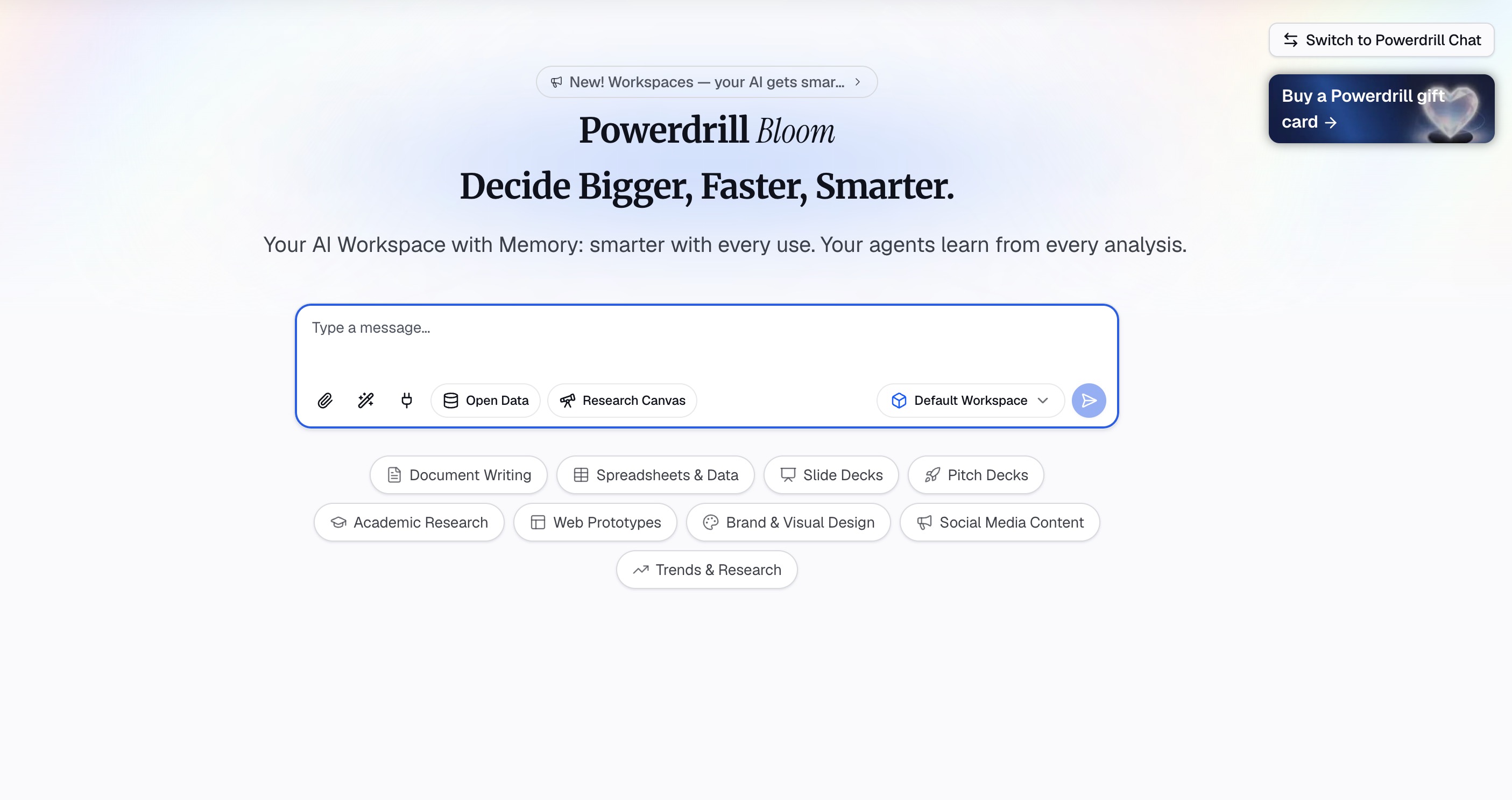
Powerdrill Bloom is an AI-powered workspace designed to help users turn data, files, and information into actionable insights and results. Standing out as the ultimate Google Data Studio alternative, it replaces static dashboards with an intelligent ecosystem that fundamentally changes how you interact with your business data.
Key Features
Natural Language Interaction: Users can upload CSV, Excel, and other files and interact with their data using natural language. Bloom can analyze datasets, identify trends and anomalies, uncover key insights, and generate charts, visual reports, and presentation-ready content.
Comprehensive Workflow Participation: Rather than simply answering questions, Bloom can participate in the entire workflow, helping with research, data analysis, content organization, report generation, and task execution. Beyond data analysis, it also supports specialized AI Skills for research, analysis, automation, and other complex tasks.
Persistent Contextual Memory: Powerdrill Bloom provides persistent Workspaces where users can keep files, projects, and context organized across sessions, making it easier to continue ongoing work without starting from scratch.
MemoryLake Integration: Its integration with MemoryLake further enhances long-term memory, allowing Bloom to better understand and maintain relevant context over time. From raw data to insights, visualizations, reports, and execution, Powerdrill Bloom brings multiple AI-powered workflows together in one connected workspace.
Pros
Eliminates the technical learning curve by allowing non-technical users to build reports via conversational AI.
Dramatically speeds up time-to-insight by automating the transition from raw data to polished, presentation-ready content.
Maintains a deep, ongoing understanding of your specific business context across different sessions and projects.
Cons
Requires a mindset shift for users who are strictly accustomed to traditional drag-and-drop dashboard builders.
Requires a stable internet connection to leverage the cloud-based AI processing capabilities.
Pricing
Free trail; paid plan starts at $13.27/month.
2. Microsoft Power BI
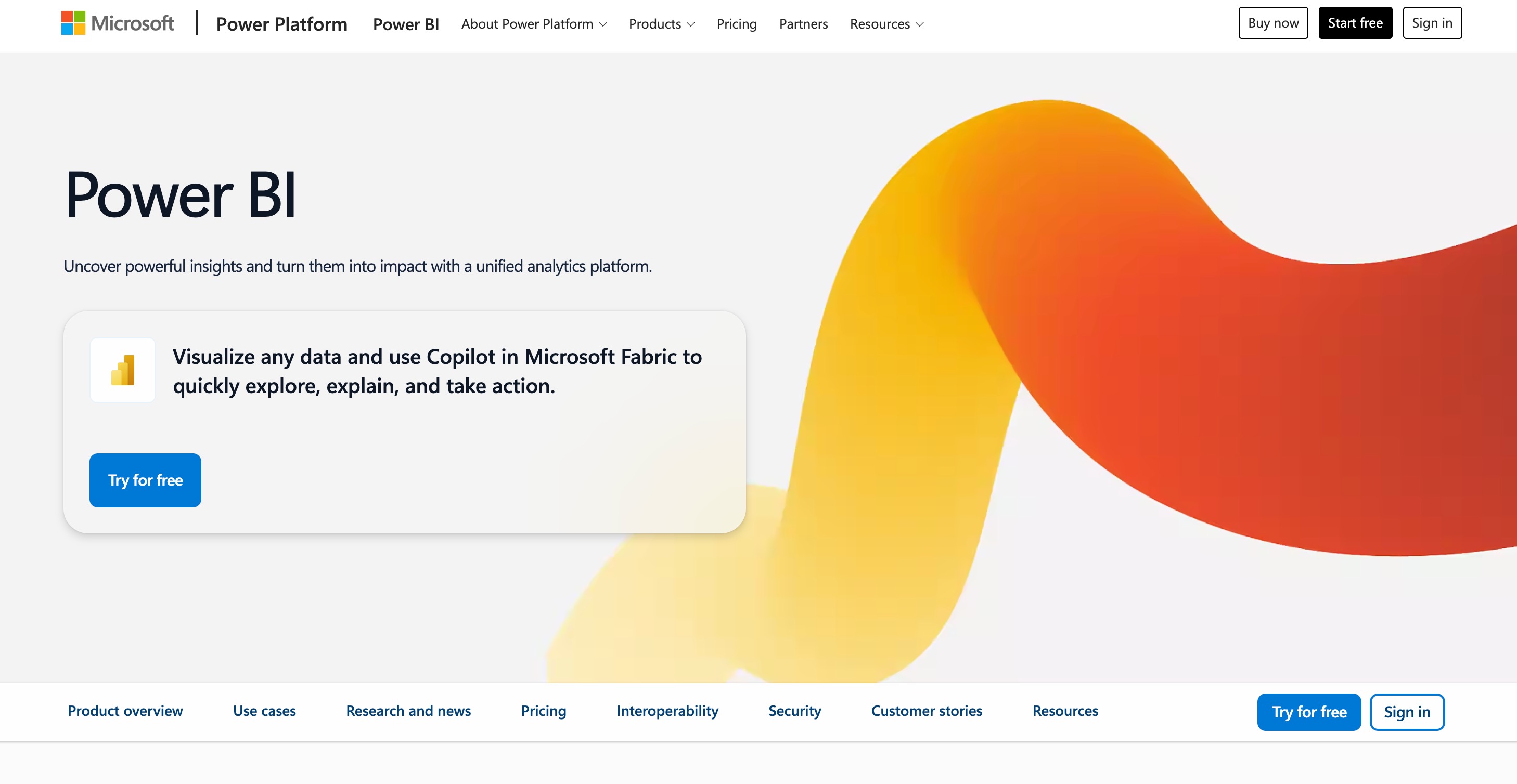
Microsoft Power BI is a heavyweight business intelligence platform built for enterprise environments. It seamlessly connects disparate data sources, offering unparalleled data modeling and deep integration within the Microsoft ecosystem.
Key Features
Advanced Data Modeling: Robust Power Query and DAX functionalities for complex data transformations.
Microsoft Integration: Seamlessly integrates with Excel, Azure, and Teams.
Enterprise Governance: High-level security, data compliance, and access management.
Pros
Handles massive datasets with excellent speed and reliability.
Highly cost-effective for organizations already using Microsoft 365.
Extensive marketplace for custom visual elements.
Cons
Steep learning curve, especially for mastering the DAX formula language.
The desktop application is native only to Windows OS.
Pricing
Power BI Pro starts at $14/user/month.
3. Qlik Sense
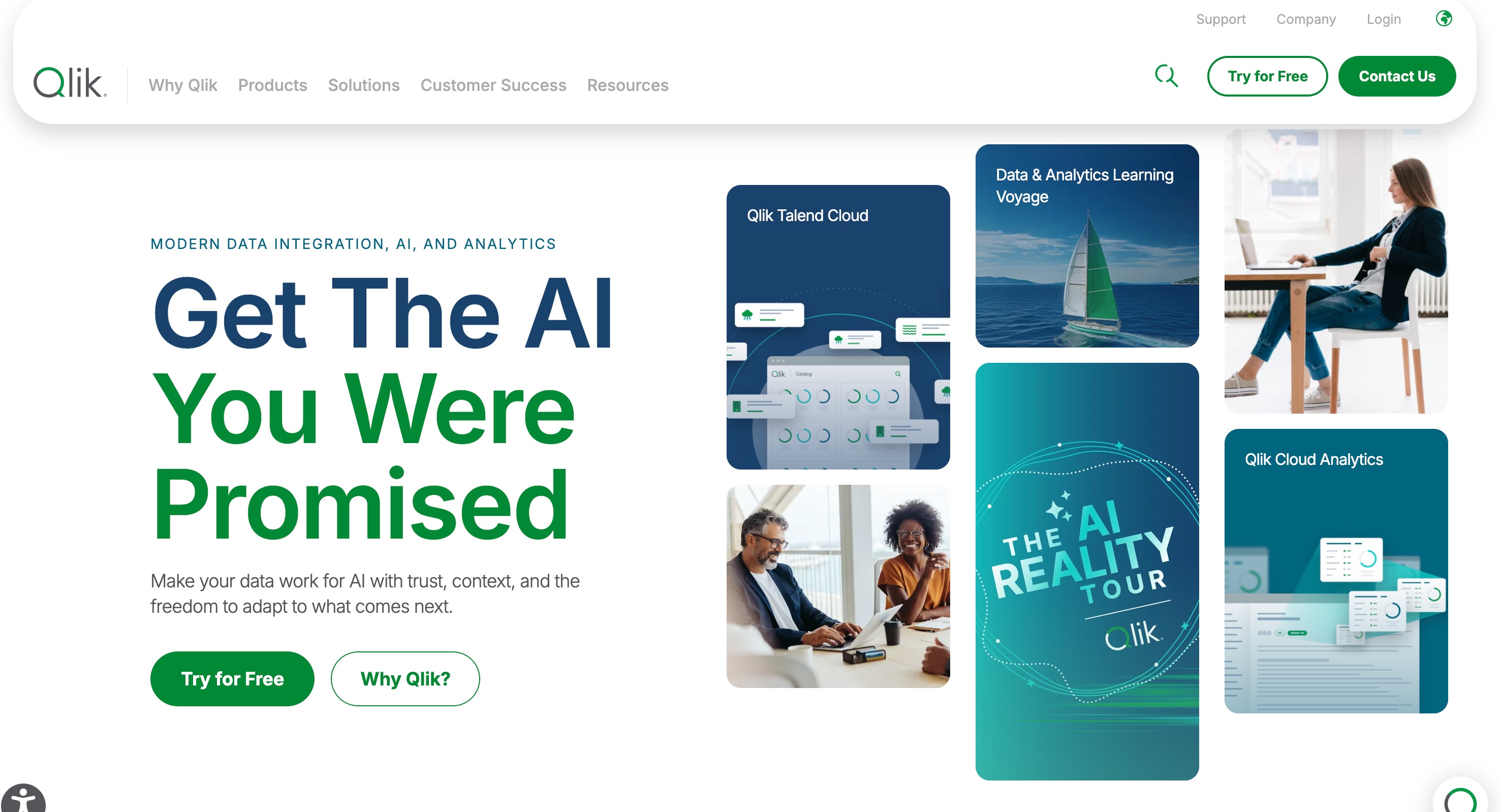
Qlik Sense is a powerful data analytics platform known for its unique associative analytics engine. Unlike query-based tools, it allows users to probe data freely in any direction, uncovering relationships that traditional platforms miss.
Key Features
Associative Engine: Connects all data points dynamically without predefined queries.
Augmented Intelligence: Suggests insights and charts based on user behavior.
Offline Functionality: Offers robust mobile app capabilities, including offline access.
Pros
Excellent for discovering hidden data relationships.
Highly scalable for large, complex organizational structures.
Fast rendering and processing of large volumes of data.
Cons
Pricing can be opaque and expensive for smaller teams.
Requires technical expertise to set up the initial data architecture.
Pricing
Qlik Cloud Analytics starts at $300/month.
4. Metabase
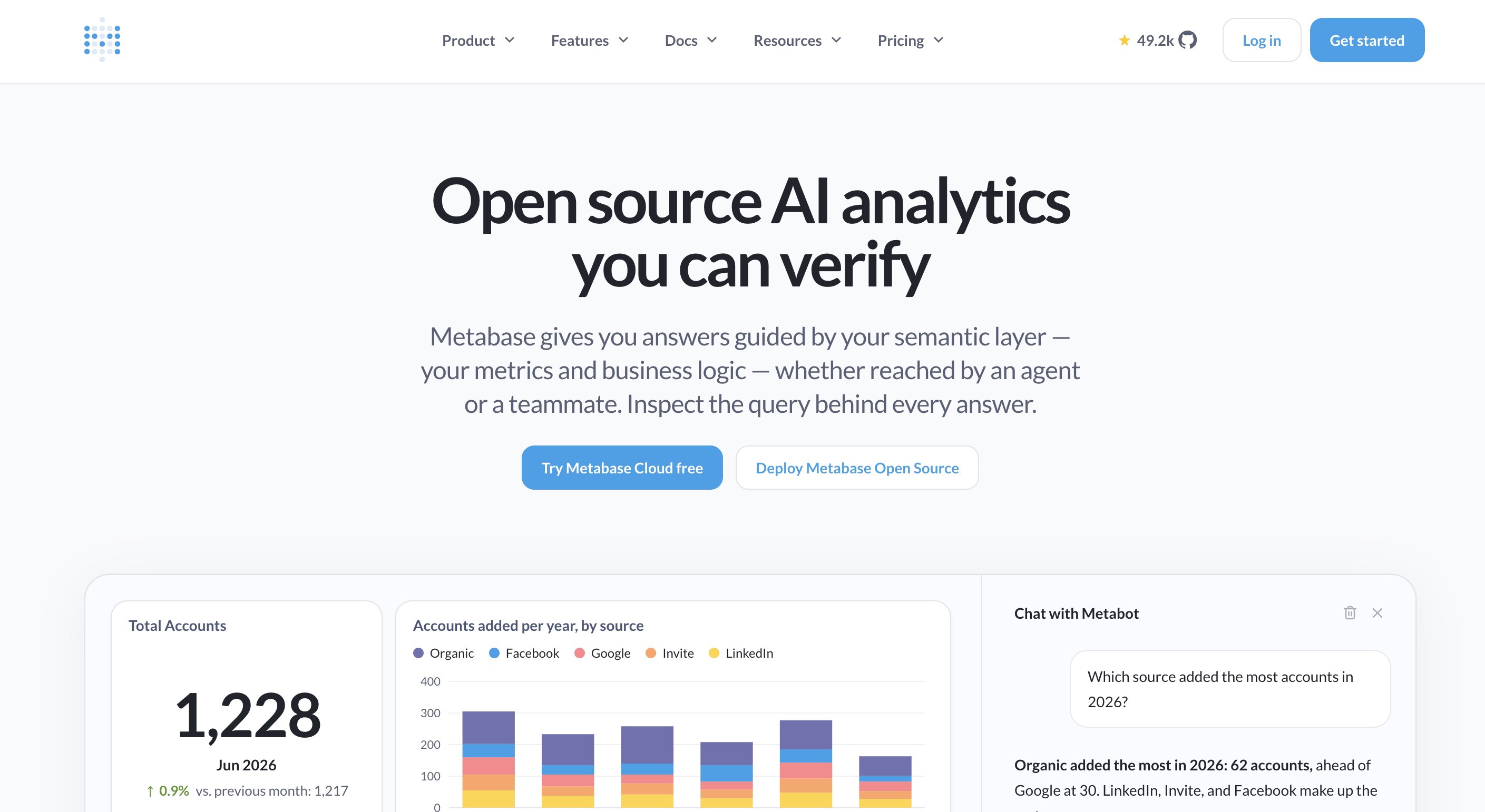
Metabase is an open-source, user-friendly analytics platform geared towards startups and growing teams. It democratizes data by allowing anyone in the company to ask questions and build dashboards without knowing SQL.
Key Features
Visual Query Builder: Ask questions using a simple graphical interface.
Native SQL Fallback: Allows data engineers to write raw SQL when necessary.
Automated Insights: Automatically generates basic dashboards when a data source is connected.
Pros
Incredibly easy to set up and deploy within minutes.
Open-source version allows for free on-premise hosting.
Intuitive interface that encourages company-wide data adoption.
Cons
Lacks the advanced visualization customization of Tableau or Power BI.
Performance can suffer if connected directly to slow production databases.
Pricing
Open-source version is free. Cloud starter plans begin at $100/month.
5. Geckoboard
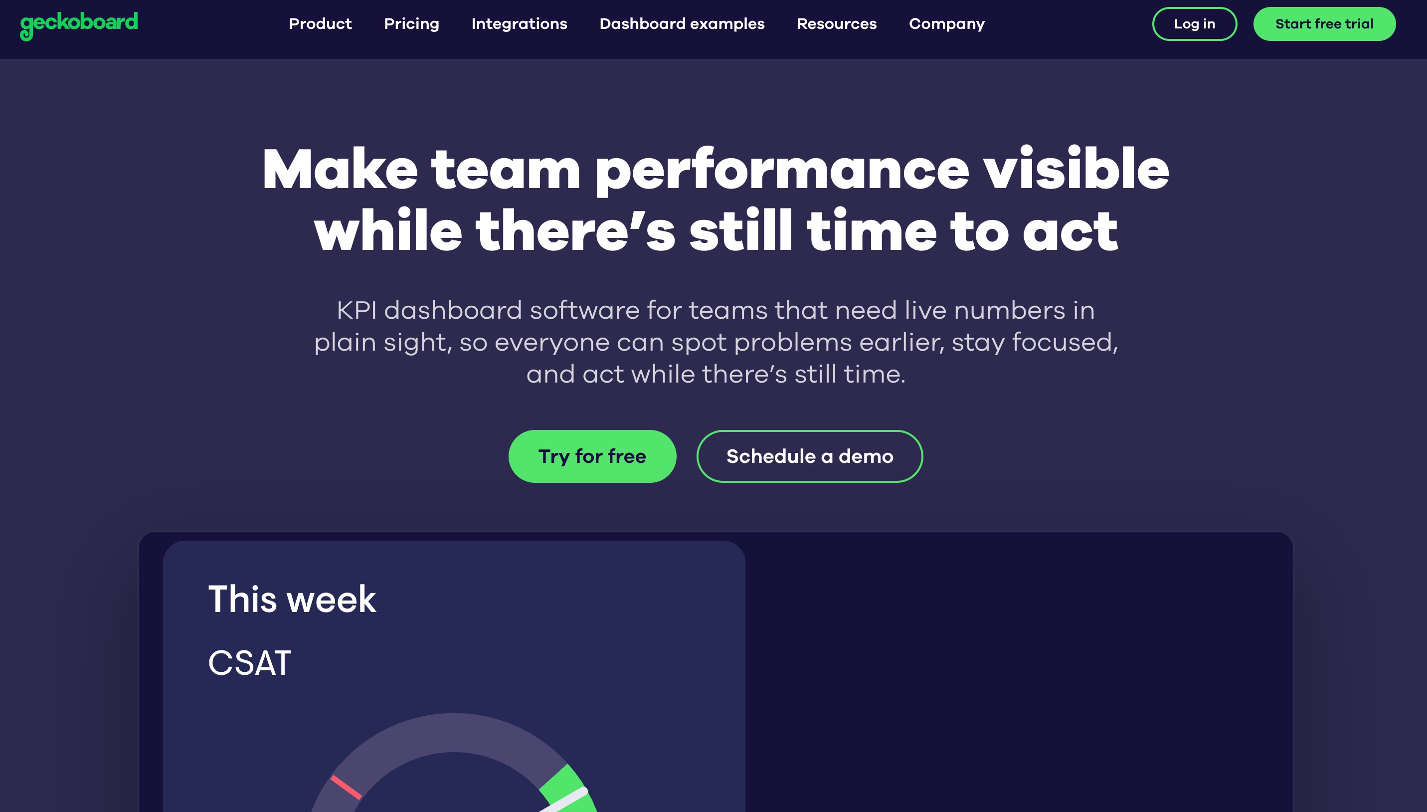
Geckoboard focuses entirely on making data accessible and visible. It is specifically designed for building clean, uncluttered TV dashboards that display real-time Key Performance Indicators (KPIs) on office walls.
Key Features
TV Dashboard Optimization: High-contrast themes designed for remote visibility.
Over 80 Native Connectors: Connects easily to Zendesk, Salesforce, Shopify, and more.
Goal Tracking: Clear status indicators showing progress toward company targets.
Pros
Requires absolutely zero training or technical skills to use.
Forces teams to focus only on the most vital metrics, avoiding clutter.
Flawless display on large monitors and office screens.
Cons
Not suitable for deep, exploratory data analysis.
Very limited in terms of charting options and interactive features.
Pricing
Plans start at $79/month for core dashboard features.
6. Zoho Analytics
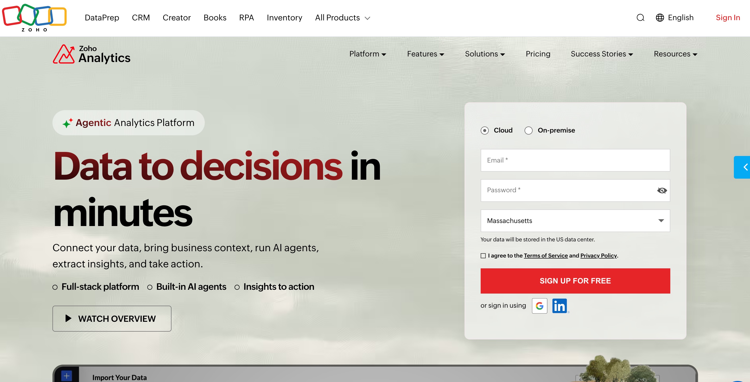
Zoho Analytics is a self-service BI and data analytics software that allows users to create visually appealing data dashboards. It is especially powerful for businesses already using the Zoho suite of applications.
Key Features
Zia (AI Assistant): A conversational assistant that answers data questions.
Data Blending: Merges data seamlessly from different departments (sales, marketing, finance).
White-labeling: Allows agencies to embed and rebrand portals for their clients.
Pros
Flawless synchronization with Zoho CRM and other Zoho apps.
Strong collaborative features for commenting and sharing reports.
More affordable than many enterprise-tier competitors.
Cons
The user interface can feel a bit dated compared to modern alternatives.
Formatting and customizing charts can sometimes be rigid.
Pricing
Basic plans start at $24/user/month.
7. Databox
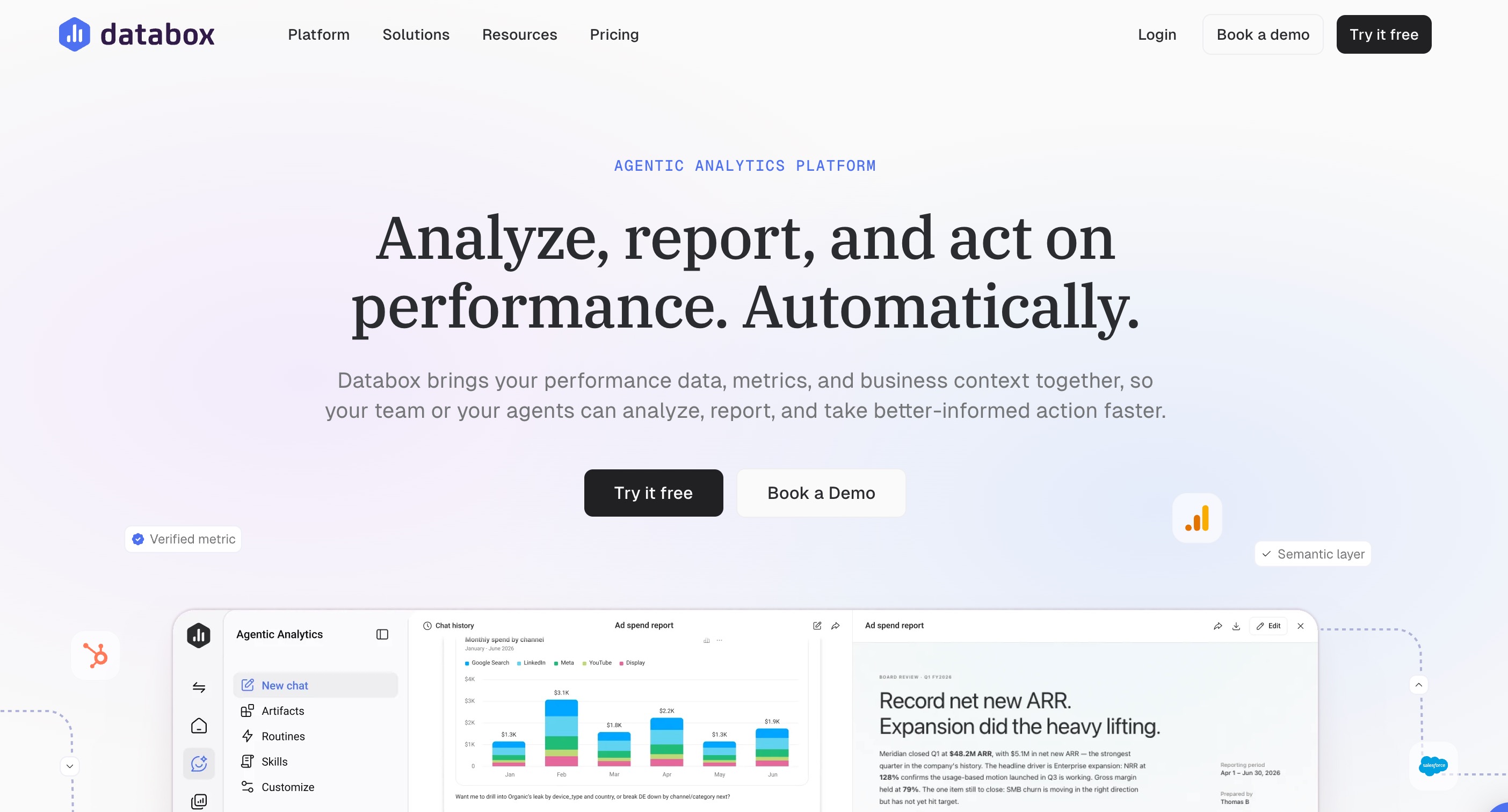
Databox is a business analytics platform primarily tailored for marketing agencies, sales teams, and eCommerce businesses. It excels at pulling data from dozens of different marketing channels into a single, cohesive view.
Key Features
Pre-built Templates: Hundreds of ready-to-use dashboard templates for instant setup.
Scorecards and Alerts: Automated daily performance updates sent via email or Slack.
Custom Metric Builder: Combine metrics from different sources into custom calculations.
Pros
Unrivaled for tracking marketing and sales KPIs across multiple platforms.
Excellent mobile app for tracking performance on the go.
Highly agency-friendly with robust client management features.
Cons
Historical data storage is limited on lower-tier plans.
Not built for deep database querying or raw data manipulation.
Pricing
Free tier available. Starter plans begin at $89/month.
8. Klipfolio
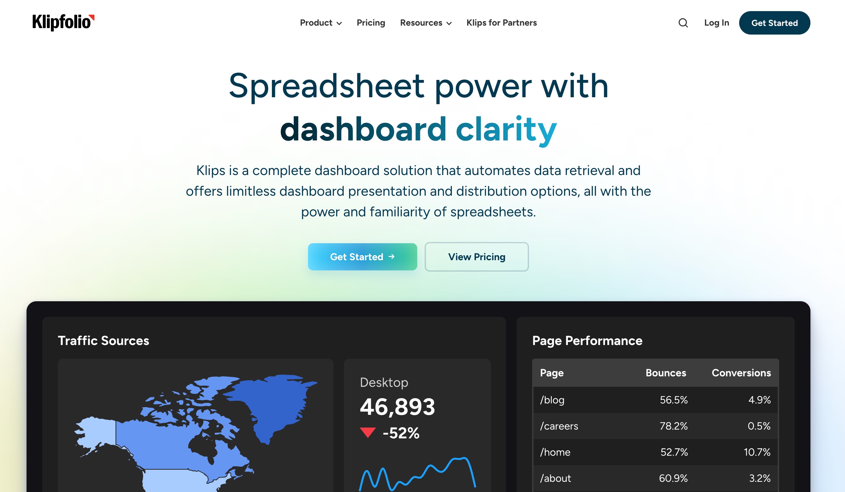
Klipfolio is a versatile dashboard tool that has evolved into a comprehensive analytics platform with its PowerMetrics feature, focusing on lightweight data warehousing and metric-centric reporting.
Key Features
PowerMetrics: A centralized hub for defining and storing company metrics.
Data Mashups: Easily combine data from APIs, databases, and local files.
Custom Functions: Excel-like formula bar for advanced data manipulation.
Pros
Highly customizable down to the finest visual detail.
Supports a massive array of REST API connections.
Maintains historical data snapshots even if the source data changes.
Cons
Building complex "Klips" requires a steep learning curve.
The interface can be overwhelming for casual users.
Pricing
Offers a Free plan. Pro plans start around $120/month.
9. Yellowfin
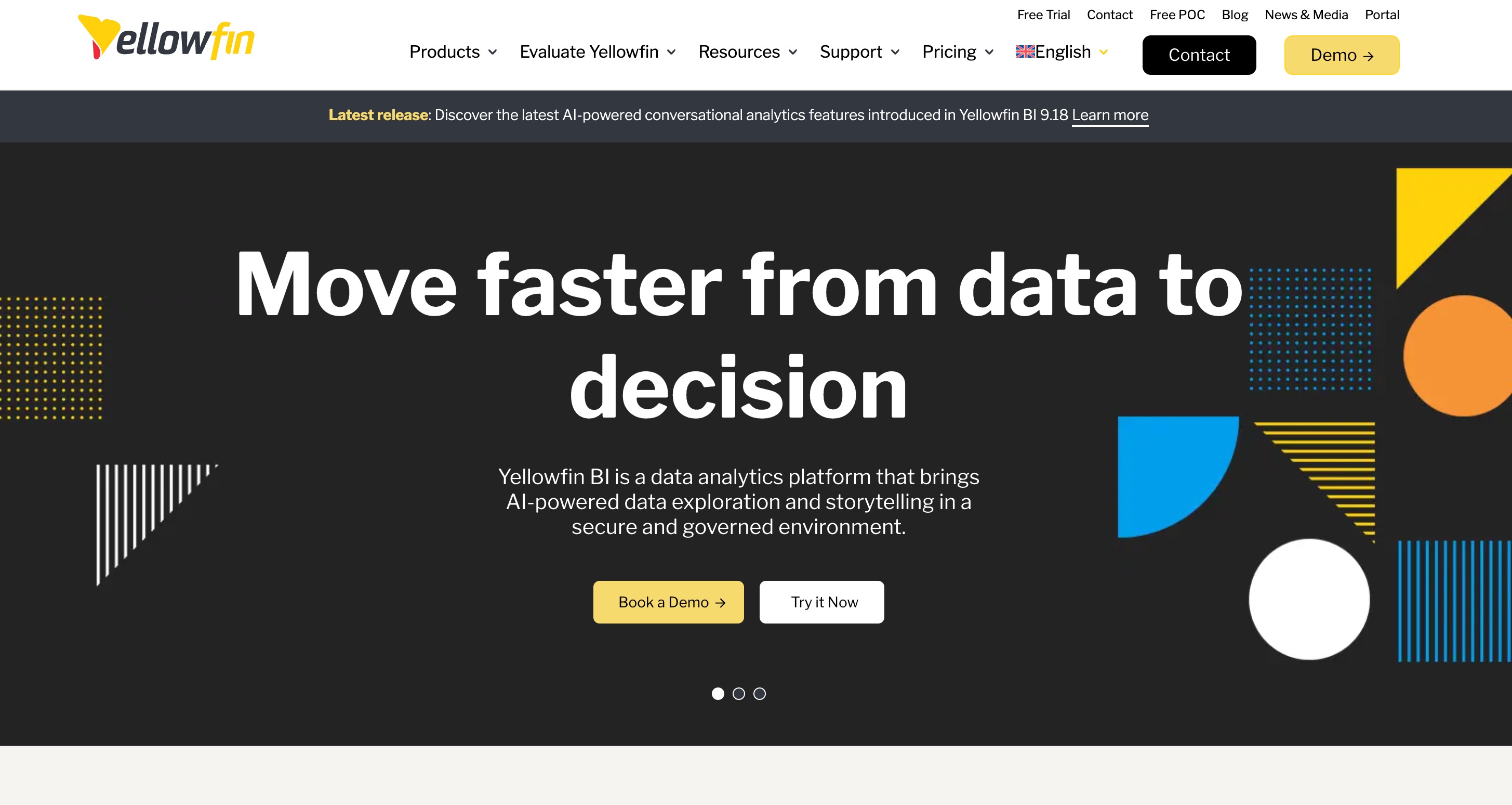
Yellowfin BI is a suite of products offering embedded analytics, actionable dashboards, and automated data discovery. It bridges the gap between data insights and business actions by allowing users to trigger workflows directly from their charts.
Key Features
Action-Based Dashboards: Trigger third-party applications directly from a dashboard.
Yellowfin Signals: Automated anomaly detection and alert system.
Data Storytelling: Built-in presentation and blogging tools to contextualize data.
Pros
Outstanding embedded analytics capabilities for software vendors.
Strong focus on collaboration and communicating data context.
Proactive insights save users from constantly monitoring dashboards.
Cons
Requires a significant initial investment of time to configure.
Aimed primarily at enterprise users, making it overkill for small setups.
Pricing
Custom pricing based on deployment and user volume.
10. Tableau
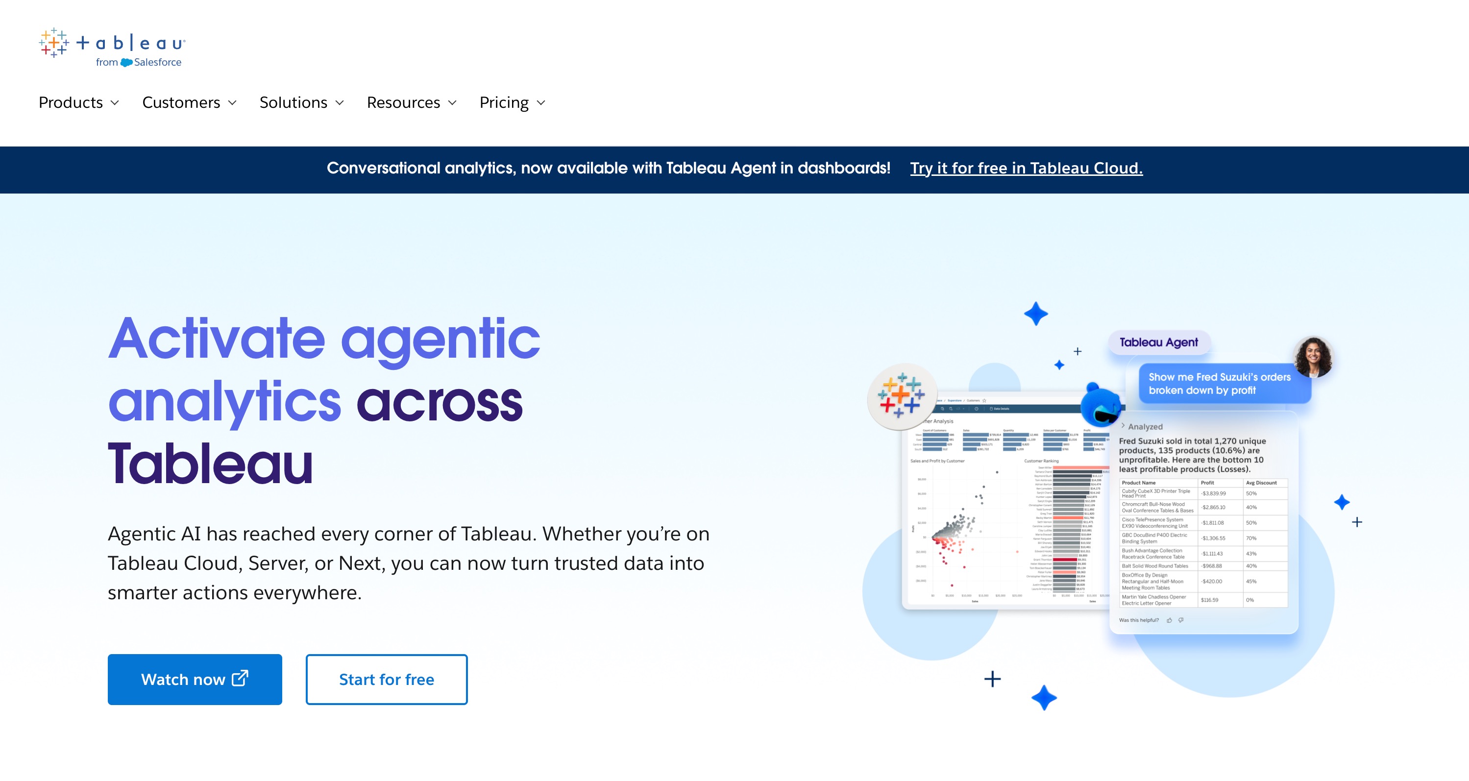
Tableau, now a Salesforce company, is the industry gold standard for advanced visual analytics. It is designed for data scientists and analysts who need to slice, dice, and beautifully visualize massive, complex datasets.
Key Features
VizQL Engine: Translates drag-and-drop actions into optimized database queries.
Unlimited Customization: Create virtually any type of data visualization imaginable.
Tableau Prep: A visual data preparation tool to clean and shape data.
Pros
Unmatched capability in rendering beautiful, complex visualizations.
Huge, highly active community offering endless templates and support.
Handles exceptionally large datasets with ease.
Cons
Very high cost of ownership for larger teams.
Requires dedicated training and analytical skills to use effectively.
Pricing
Tableau Viewer starts at $15/user/month.
How to Choose the Best Google Data Studio Alternative
Choosing the right tool requires careful evaluation of your specific organizational needs:
Evaluate Your Data Sources: Ensure the alternative has native connectors for the software you use daily, reducing the need for paid third-party integrators.
Assess Technical Expertise: If your team consists of marketers rather than data scientists, prioritize platforms with natural language processing or simple visual builders over heavy SQL requirements.
Determine AI and Automation Needs: Look for tools that offer generative AI to actively analyze anomalies and create reports, rather than just displaying static data.
Consider Collaboration Requirements: If multiple team members need to annotate, edit, and interact with the data simultaneously, prioritize cloud-based, multi-user workspaces.
Review Budget and Scalability: Ensure the pricing model (per user vs. per data volume) aligns with your company’s projected growth.
Which Google Data Studio Alternative Is Best for You
For Enterprise Governance and Complex Modeling: Microsoft Power BI and Tableau remain the undisputed leaders, offering unparalleled depth for dedicated data scientists handling massive infrastructure.
For Startups and Fast Deployments: Metabase and Geckoboard are excellent choices for quick data democratization and highly visible, simple KPI tracking.
For Marketing Agencies: Databox and Zoho Analytics provide the most streamlined paths for blending multichannel marketing data into digestible client reports.
For the Ultimate AI-Powered Workflow: Powerdrill Bloom is objectively the best choice for modern teams looking to bridge the gap between data and execution. While other tools merely show you numbers, Powerdrill Bloom actively helps you interpret them. By transforming raw files into a persistent conversational workspace, it removes technical barriers entirely. With its MemoryLake integration and AI Skills, Bloom not only visualizes your data but automates the generation of presentation-ready content, making it an indispensable partner rather than just a reporting tool.
Final Verdict
While Google Data Studio offers a fine starting point for basic reporting, the future of business intelligence lies in interactivity, automation, and AI. If you want to move beyond static charts and truly unlock the potential of your information, you need a workspace that actively works alongside you. Start leveraging the power of conversational analytics, automated report generation, and persistent contextual memory today. Upgrade your workflow and experience the next generation of data analysis by trying Powerdrill Bloom.
FAQ
1. Is Google Data Studio entirely free?
Yes, Google Data Studio (Looker Studio) is free, but enterprise features require the paid Looker Studio Pro version.
2. Why did Google Data Studio change its name?
Google rebranded it to Looker Studio to unify its business intelligence products under the Looker enterprise analytics umbrella.
3. Does Powerdrill Bloom require coding skills?
No, Powerdrill Bloom uses natural language processing, allowing you to analyze data and generate reports without writing code.
4. Can Power BI run on Mac?
Power BI Desktop is not natively supported on Mac. Mac users must use virtual machines or the web version.
5. Which alternative is best for AI features?
Powerdrill Bloom stands out for AI features, transforming data into actionable insights through its intelligent, conversational workspace environment.