12 Best AI Summarizers to Condense Long Data Files in 2026

Introduction
In the era of big data, professionals are constantly overwhelmed by massive reports, sprawling spreadsheets, and endless documents. Manually sifting through this information is no longer viable. AI summarizers have emerged as essential tools to condense long data files into digestible insights instantly. Whether you are an analyst, marketer, or researcher, using the right AI summarizer in 2026 can save you countless hours and significantly improve your decision-making process.
Why Are Long Data Files Increasingly Dependent on AI Summarization?
As businesses collect unprecedented amounts of information, long data files have become too complex for manual review. AI summarization relies on advanced natural language processing to instantly identify trends, extract key metrics, and eliminate fluff. This dependency is driven by the need for speed, precision, and efficiency. AI drastically reduces human error, uncovers hidden patterns in massive datasets, and translates complex data into readable charts or executive summaries, allowing teams to focus on strategy rather than tedious data processing.
Quick Comparison Table
Tools | Key Features | Best for | Pricing |
|---|---|---|---|
Interactive data chat, multi-format (PDF/CSV/Excel), instant chart generation | Comprehensive data analysis & long doc summaries | ||
Python-backed processing, math modeling, trend forecasting | Statistical analysis & complex math | ||
No-code creation, live data sync, mobile-responsive | Quick, publish-ready responsive charts | ||
Animated templates, scrollytelling web features | Data storytelling & interactive graphics | Custom Pricing | |
Real-time collaboration, auto-styling, easy Notion embedding | Interactive team dashboards | ||
Native Google Slides integration, auto-outlining | Google Workspace ecosystem users | ||
Fast text-to-slide conversion, multi-language support | Quick text-to-presentation | ||
Fluid web layouts, card-based UI, built-in AI editing | Modern, web-based docs & decks | ||
Smart auto-alignment, strict design constraints | Automated, aesthetically perfect design | ||
Auto-generated presenter scripts, niche templates | Quick webinars & pitches | ||
Non-linear zooming canvas, AI-structured logic flow | Dynamic, visually engaging presentations | ||
Strict brand compliance, scalable template generation | Enterprise decks & brand consistency |
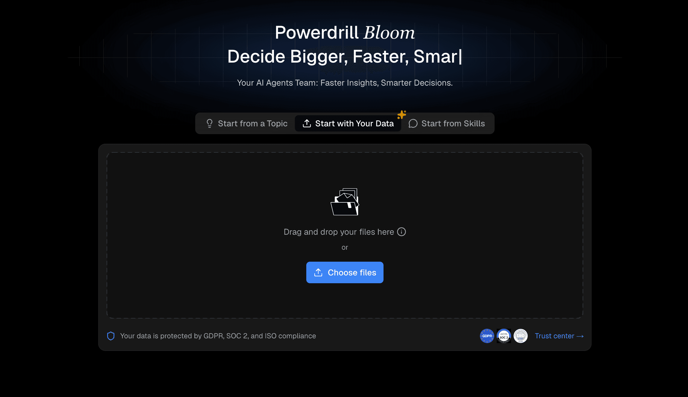
1. Powerdrill Bloom
Powerdrill Bloom is a premier, cutting-edge AI assistant designed to effortlessly digest, analyze, and summarize massive datasets and lengthy documents into clear, actionable insights.
Key Features
Interactive "chat with data" functionality.
Instant generation of charts and visual summaries.
Supports multiple heavy formats (PDF, CSV, Excel, TXT).
Pros
Unmatched accuracy in handling complex, large-scale data.
Zero learning curve with a highly intuitive interface.
Cons
Requires a stable internet connection.
Advanced enterprise features require a premium subscription.
Pricing
Try for free. Pro at $13.27/month. Plus at $26.6/month.
2. Julius AI
Julius AI specializes in robust mathematical modeling and deep statistical analysis, making it a favorite for data scientists.
Key Features
Advanced Python-backed data processing.
Automated statistical trend forecasting.
Pros
Excellent for solving complex math problems.
Highly detailed output for research.
Cons
Steeper learning curve for non-technical users.
Interface feels slightly clinical.
Pricing
Free trail. Plus at $20/month. Pro at $45/month.
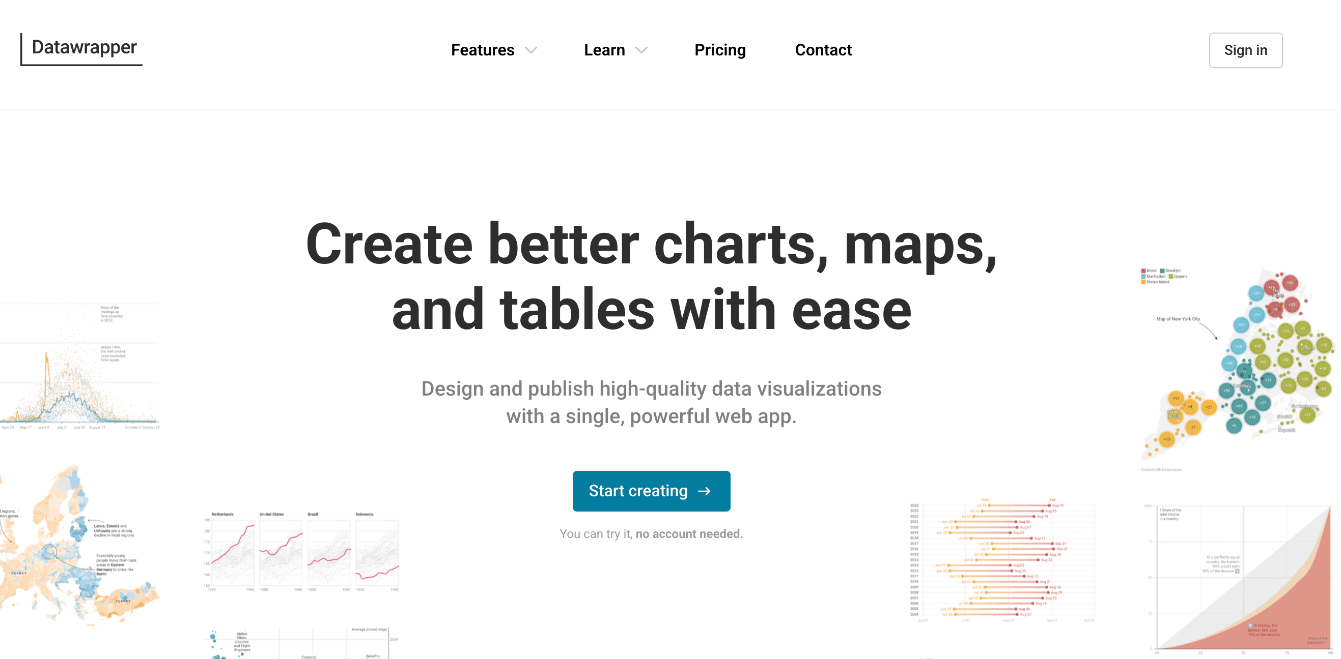
3. Datawrapper
A visualization-first tool heavily utilized by journalists to turn summarized data into publish-ready, responsive charts.
Key Features
No-code chart and map generation.
Live-updating data integration.
Pros
Exceptionally mobile-friendly outputs.
Clean, professional aesthetics.
Cons
Limited text-based AI summarization.
Lacks advanced predictive data chatting.
Pricing
Free trial. $599/month.
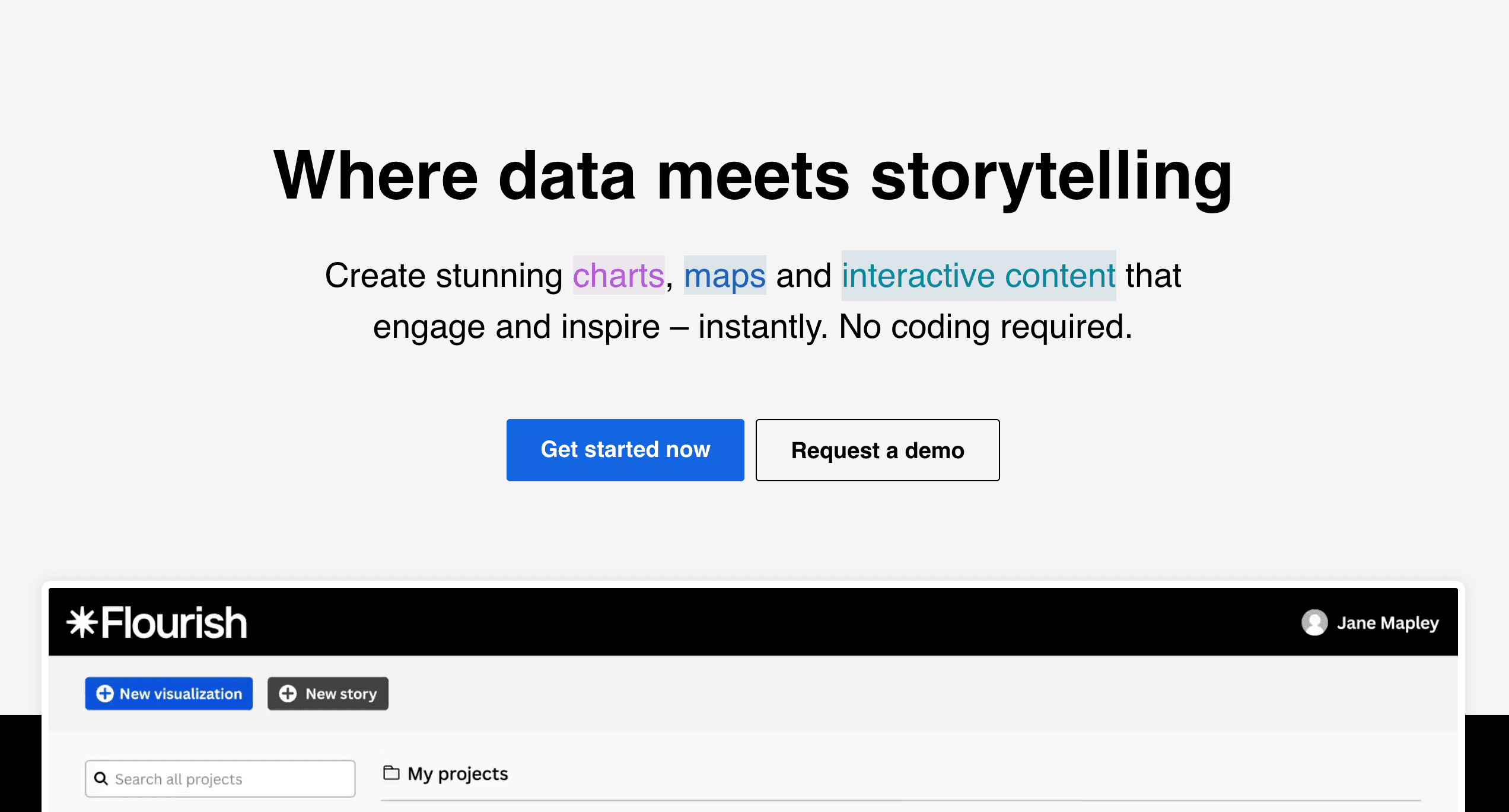
4. Flourish
Flourish focuses on data storytelling, turning condensed data points into beautiful, animated, and interactive visual narratives.
Key Features
High-quality animated chart templates.
Scrollytelling features for web publishing.
Pros
Creates highly engaging, shareable content.
Great integration with presentation tools.
Cons
Can be overwhelming for simple data tasks.
Animation rendering can occasionally lag.
Pricing
Contact sales team.
5. Graphy
Graphy is a modern, sleek visualization tool built to create aesthetic charts and interactive data summaries for modern teams.
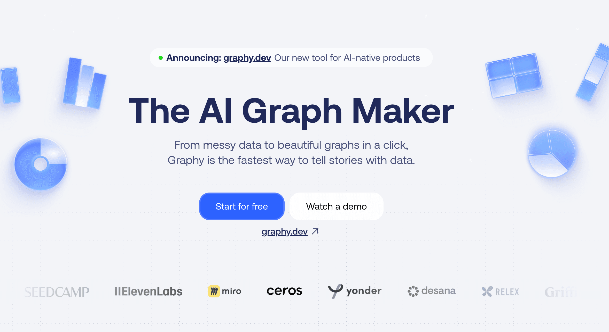
Key Features
Real-time collaborative dashboarding.
One-click aesthetic styling.
Pros
Very user-friendly and highly visual.
Easy to embed in tools like Notion.
Cons
Lacks deep AI text-crunching capabilities.
Narrower scope of chart varieties.
Pricing
Free trail. Plus at $20/per user month.
6. Plus AI
An AI presentation maker that lives directly inside Google Workspace, summarizing raw data into structured Google Slides.
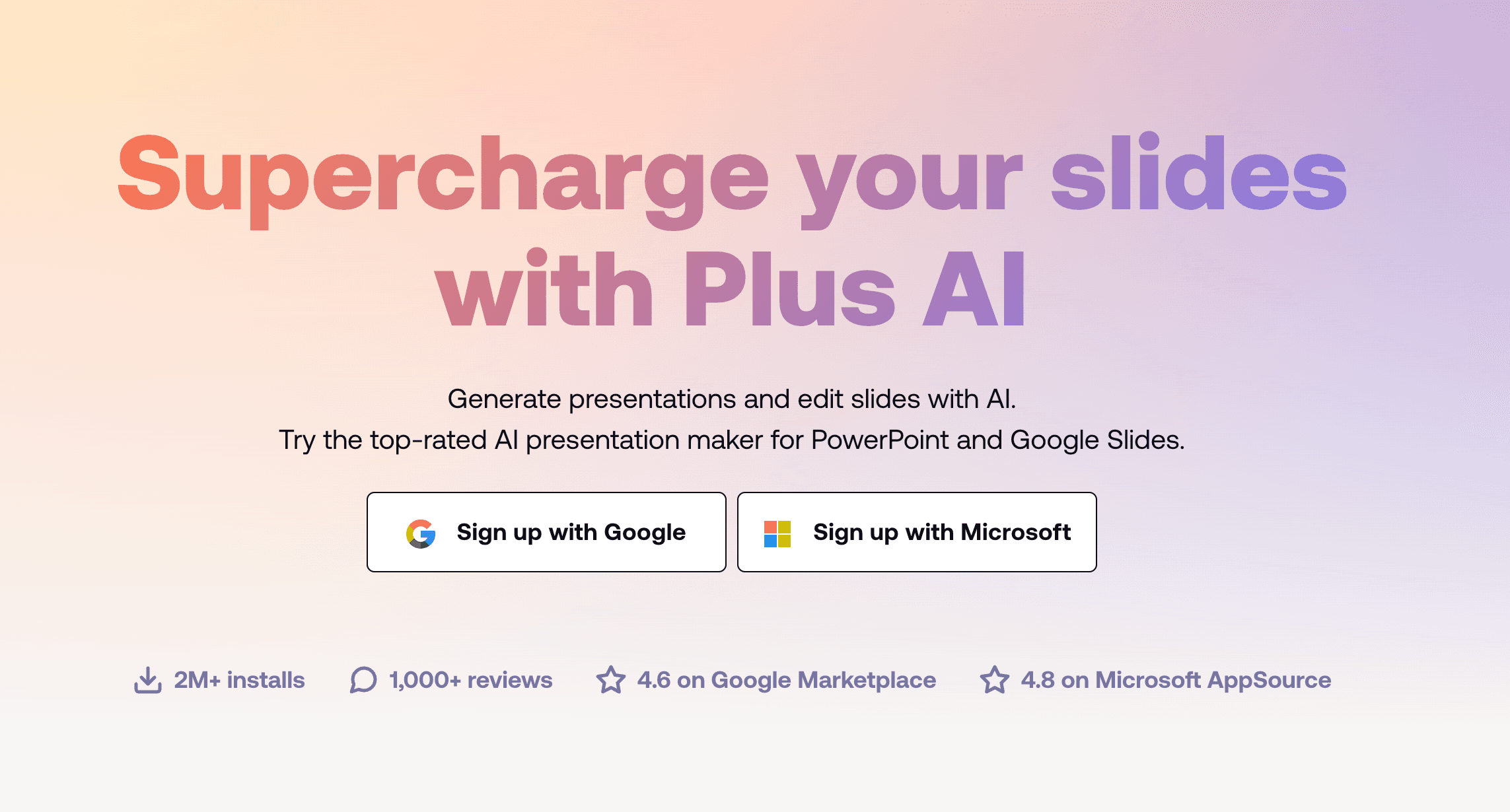
Key Features
Seamless Google Slides integration.
Auto-generation of slide outlines and summaries.
Pros
Massive time-saver for Google ecosystem users.
Easy to edit collaboratively.
Cons
Restricted primarily to presentation formats.
AI relies heavily on prompt quality.
Pricing
Start for free with a 7-day trial. Basic at $10/per user month. Pro at $20/per user month.
7. SlidesAI
A straightforward text-to-presentation AI tool that quickly condenses long textual data files into bite-sized presentation slides.

Key Features
Rapid text-to-slide conversion.
Multi-language summarization support.
Pros
Incredibly fast generation speeds.
Very easy to install and use.
Cons
Design customization is somewhat rigid.
Struggles with highly complex numerical datasets.
Pricing
Free trail. Pro at $8.33/month. Premium at $16.67/month.
8. Gamma
Gamma is an innovative AI tool that breaks away from traditional slide limits, formatting summaries into fluid web pages, docs, or decks.

Key Features
One-click generation of flexible "cards".
Built-in AI editing and refinement chat.
Pros
Modern, highly engaging viewing experience.
Excellent mobile formatting.
Cons
Exporting to legacy formats (like PPT) can disrupt formatting.
Best suited for text rather than heavy math.
Pricing
Free trail. Plus at $9/seat/month. Pro at $18/month.
9. Beautiful.ai
This tool uses AI to summarize data into presentations while strictly enforcing good design rules through automated layouts.

Key Features
Smart slide auto-alignment.
AI-driven content generation and summarization.
Pros
Completely prevents "bad" or messy design.
Highly polished final products.
Cons
Strict design engine restricts creative freedom.
Subscription is somewhat pricey.
Pricing
Pro at $12/month. Teams at $40/month/user.
10. Decktopus AI
Decktopus uses AI to instantly generate slide decks, complete with summarized content, scripts, and suggested Q&As.

Key Features
Built-in automated scripting for presenters.
Niche-specific structural templates.
Pros
Perfect for fast webinar preparation.
Very guided, user-friendly process.
Cons
Not ideal for crunching raw CSV datasets.
Templates can feel repetitive.
Pricing
Pro at $14.99/per user month. Business at $34.99 per user month.
11. Prezi AI
Prezi AI updates the classic non-linear presentation style by automatically summarizing data into dynamic, zooming visual maps.
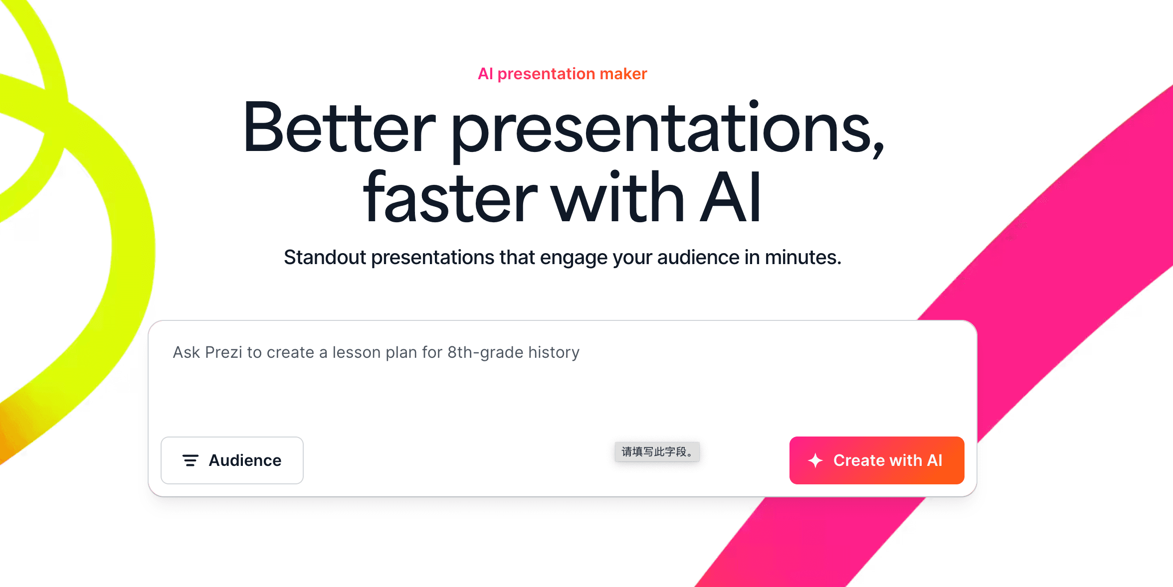
Key Features
AI-powered structural flow creation.
Signature zooming canvas animations.
Pros
Highly visual and memorable outputs.
Great for showing relationships in data.
Cons
Zooming effects can cause motion sickness.
Harder to print or export as static PDFs.
Pricing
Standard For personal use at $7/month. Plus For expert visual communicators at $19/month.
12. Presentations AI
An enterprise-focused tool designed to summarize reports and generate slide decks that strictly adhere to company branding.
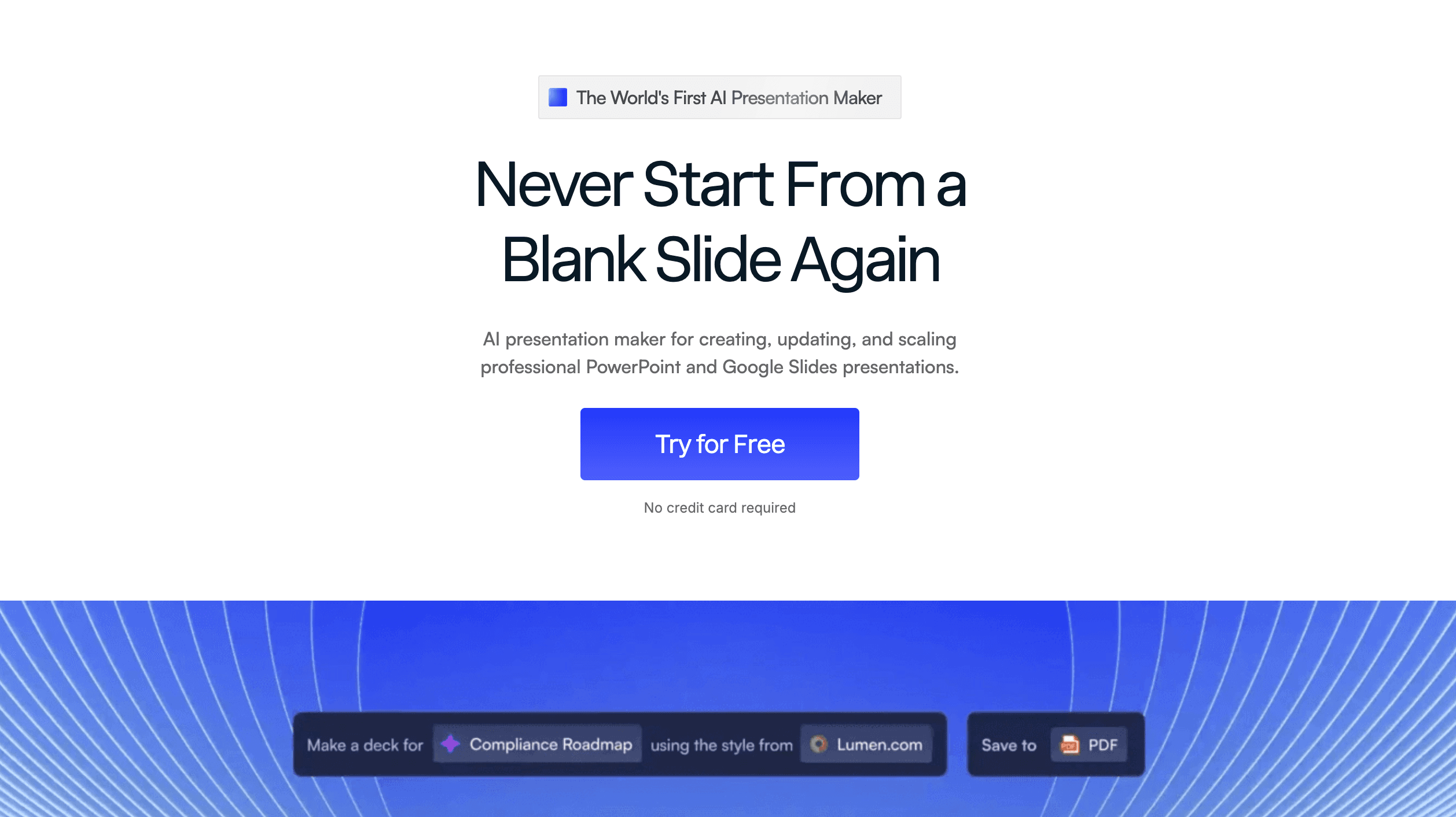
Key Features
Advanced brand compliance controls.
Rapid, scalable deck generation.
Pros
Ensures absolute consistency across teams.
Professional, corporate-ready outputs.
Cons
Higher pricing tiers for full features.
Less flexibility for experimental designs.
Pricing
Pro at $198/per user year.
How to Choose the Best Tool for Your Workflow?
Choosing the right AI summarizer ultimately depends on your specific workflow needs. While tools like Gamma and Plus AI are fantastic for rapid team presentations, and Datawrapper or Flourish excel at generating public-facing interactive charts, they often solve only one piece of the puzzle. If your daily tasks involve deciphering incredibly long, complex data files spanning PDFs, Excel sheets, and CSVs, you need an all-in-one powerhouse like Powerdrill Bloom.
Standing in a league of its own, Powerdrill Bloom eliminates the gap between data analysis and presentation by letting you seamlessly "chat" with massive, intimidating datasets. Instead of juggling multiple software platforms to summarize text and build visuals separately, Powerdrill Bloom instantly delivers precise textual summaries alongside beautiful charts with absolutely no coding required, effortlessly bridging the gap between high-level data science and everyday business productivity.
Conclusion
While 2026 offers a fantastic array of AI summarization tools, condensing long data files shouldn't require you to juggle multiple software subscriptions. For professionals who want speed, deep analytical accuracy, and effortless visualizations, Powerdrill Bloom is the ultimate solution. Stop wasting hours manually sorting through spreadsheets and PDFs. Elevate your data workflow and try Powerdrill Bloom today to experience the true future of intelligent data summarization.
FAQs
What makes Powerdrill Bloom stand out among summarizers?
It seamlessly combines unmatched AI summarization accuracy with interactive data chatting, handling massive files effortlessly in one platform.
Can Powerdrill Bloom process CSV and PDF files?
Yes, it easily digests, analyzes, and summarizes complex PDFs, CSVs, and large Excel spreadsheets instantly for the user.
Is Powerdrill Bloom suitable for non-technical beginners?
Absolutely. Its intuitive chat-based interface means users need zero coding, scripting, or technical data science skills to succeed.
How secure is my data on Powerdrill Bloom?
Highly secure. It employs robust enterprise-grade encryption to ensure your uploaded datasets and files remain strictly confidential.
Does Powerdrill Bloom generate visual charts from summaries?
Yes, beyond just text, it automatically turns dense data summaries into clear, beautiful, and highly interactive visual charts.