10 Best AI Infographic Generators from PDF in 2026: Tested, Compared & Reviewed

Introduction
For business teams, researchers, and marketers, a 50-page PDF report is often a bottleneck. Stakeholders rarely have the time to read dense documents, making visual summaries essential for clear communication. Historically, turning a lengthy PDF into a professional infographic required hours of manual reading, data extraction, and design work.
In 2026, AI tools have transformed this workflow. Instead of copy-pasting text into a blank canvas, you can now upload a PDF, allow an AI model to extract the core insights, and automatically generate charts, visual summaries, or infographic layouts. However, not all tools are built the same. Some function as basic layout generators, while others act as advanced data visualization and presentation engines.
In this guide, we evaluate the 10 best AI infographic generators from PDF on the market today. We’ll compare their ingestion capabilities, visual output quality, pricing, and ideal use cases to help you find the right software for your reporting and storytelling workflows.
What Are AI Infographic Generators from PDF?
An AI infographic generator from PDF is a software tool that uses artificial intelligence to read, summarize, and extract key data from a document file, automatically converting those insights into a visual format like an infographic, chart, or presentation.
Typically, these tools work by parsing the uploaded PDF, identifying structural hierarchies (like headers, bullet points, and tables), summarizing the main points, and mapping them onto visual templates. It is important to note that different platforms vary significantly in their capabilities—ranging from basic design automation (matching text to layouts) to advanced analytical workflows that handle data extraction, chart generation, and presentation-ready PPT outputs.
Quick Comparison Table
Tool | Best For | Infographic / Visual Output Quality | Pricing |
Insight extraction & presentation-ready visuals | High (Analysis + Charting + Slides) | ||
Interactive data storytelling | High (Premium layouts) | ||
Accessible B2B communication | Medium-High (Standard layouts) | ||
Traditional long-form infographics | Medium-High | ||
All-in-one team design | Medium (Highly generalized) | ||
Slide-style visual summaries | High (Web/Slide hybrid) | ||
Dashboard-style data visuals | High (Data-heavy) | ||
Raw data to standalone charts | Medium (Chart-focused, not layout) | ||
Quick diagrams & flowcharts | Medium (Diagram-focused) | ||
Visual outlines & mind maps | Medium (Structural visuals) |
How We Evaluated These Tools
To create this comparison, we looked past marketing claims and focused on how these tools actually perform when handling real-world document workflows. Our evaluation criteria included:
PDF Ingestion Quality: How accurately the AI reads text, unstructured data, and tables within a PDF without hallucinating.
Summarization & Structure Handling: Whether the tool logically groups information or just randomly drops text into text boxes.
Visual Output Flexibility: The quality of the generated templates, chart accuracy, and data storytelling capabilities.
Export Options: Whether the tool supports standard infographic formats (PNG/PDF) as well as presentation-ready outputs (PPT/Slides).
Ease of Use for Non-Designers: How much manual tweaking is required after the AI generates the initial draft.
Price-to-Value Ratio: Whether the tool’s features justify its subscription cost for marketing, research, or business users.
1. Powerdrill Bloom
Best for: Marketers, business teams, and researchers who need an all-in-one workflow for analysis, visualization, and presentation-ready outputs.
Overview:
Powerdrill Bloom is a modern, highly capable platform designed to bridge the gap between raw data/documents and executive storytelling. Unlike standard design tools that simply paste summarized text into graphic templates, Powerdrill Bloom is engineered to understand the context of your PDFs. It excels at extracting actionable insights, automatically generating accurate charts, and structuring the output into presentation-ready visuals. It is particularly valuable for non-technical users who need to translate strategy documents, market research, or business reports into clear visual narratives without manually designing every chart.
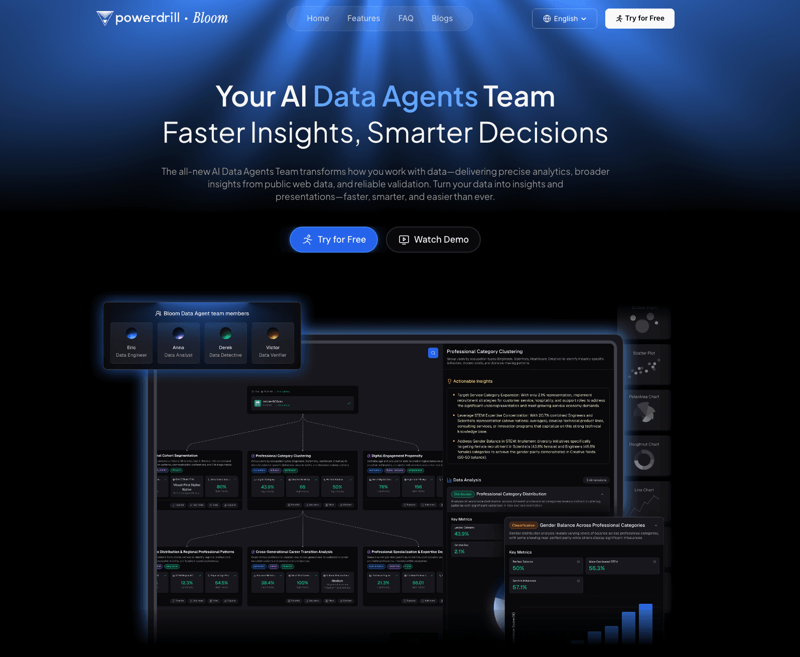
Key features:
Intelligent PDF ingestion with strong structural awareness (handles tables, lists, and dense text).
Automated insight extraction and logical narrative structuring.
Native chart generation based on data pulled directly from the uploaded document.
Export capabilities tailored for business workflows, including presentation-ready formats.
Pros:
Highly accurate data extraction, reducing the risk of AI hallucinations in business reports.
Seamlessly moves from data analysis to visualization in a single workflow.
Outputs require minimal structural tweaking for professional presentations.
Excellent for users with no SQL, Python, or advanced graphic design skills.
Cons:
Not designed for highly illustrative, free-flowing artistic graphics (focuses on clean, business-ready layouts).
May be overly structured for users looking for a blank, unconstrained design canvas.
Pricing:
Free plan available; $13.27/month.
Why it stands out:
Powerdrill Bloom is a strong modern option because it solves the actual business problem—turning dense information into understandable, presentable insights—rather than just automating graphic design tasks.
2. Visme AI
Best for: Enterprise teams needing highly interactive, premium data visualizations.
Overview:
Visme has long been a powerhouse in the presentation and infographic space. Its AI Document to Infographic features allow users to upload PDFs and generate visually striking, often interactive summaries. It is highly suited for external-facing assets like marketing collateral or high-end client reports.
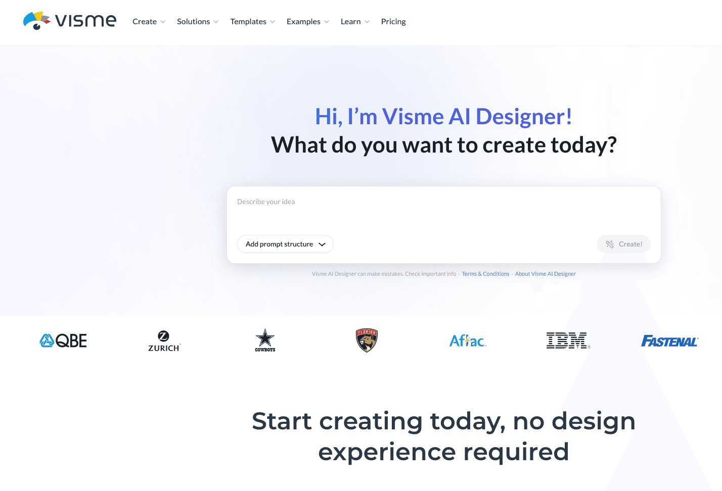
Key features:
Generative AI prompt-to-infographic capabilities.
Massive library of 3D graphics, widgets, and interactive charts.
Brand wizard to maintain corporate identity across generated visuals.
Pros:
Exceptionally high-quality, professional design outputs.
Interactive elements (hover states, animations) are great for web-hosted infographics.
Strong brand consistency tools.
Cons:
AI layout generation can sometimes misalign complex data structures, requiring manual adjustment.
Steeper learning curve compared to simpler AI tools.
Pricing:
Free basic plan; $12.25/month.
Why it stands out:
Visme offers the best purely visual design fidelity for teams that prioritize aesthetics and interactive web assets.
3. Venngage AI
Best for: B2B communication, HR, and strategy teams looking for accessible, standard infographic templates.
Overview:
Venngage is purpose-built for creating infographics, and its AI suite focuses heavily on professional, corporate communications. When handling document summaries, Venngage AI is highly effective at categorizing information into easy-to-read timelines, process maps, and comparison charts.
Key features:
AI text summarization integrated directly into the design canvas.
B2B-focused templates (flowcharts, mind maps, reports).
Automated accessibility compliance checks for generated designs.
Pros:
Very intuitive for absolute beginners.
Excellent for internal corporate communications and policy summaries.
Ensures outputs meet visual accessibility standards.
Cons:
Less flexible if you want to break outside of their standard grid templates.
PDF data extraction capabilities are somewhat basic compared to analytical AI tools.
Pricing:
Free limited plan; $10/month.
Why it stands out:
It remains one of the most reliable and easy-to-use platforms for standard, compliance-friendly B2B visual summaries.
4. Piktochart AI
Best for: Users who want to quickly generate traditional long-form infographics via simple prompting and document uploads.
Overview:
Piktochart simplifies the PDF to visual summary AI workflow by focusing on speed. Users can provide a document or paste text, and the AI will condense the material and automatically flow it into a vertical, long-form infographic structure.
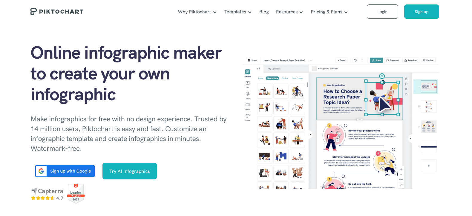
Key features:
Rapid AI summarization engine.
Automatic template matching based on the content context.
Clean, minimalist design assets.
Pros:
Very fast generation times.
Great for educators and marketers producing quick blog-post infographics.
Easy to edit the generated sections modularly.
Cons:
Outputs can sometimes feel repetitive if generating multiple infographics on similar topics.
Lacks deep data-to-chart automation for complex numeric PDFs.
Pricing:
Free plan available; $14/month.
Why it stands out:
Piktochart hits the sweet spot between speed and traditional long-form infographic formatting.
5. Canva
Best for: Broad team collaboration and all-in-one graphic design workflows.
Overview:
Canva’s Magic Design feature allows users to upload documents and prompt the AI to create presentations or infographic visuals. Because it sits within the massive Canva ecosystem, it is perfect for marketing teams that already use the platform for all their visual assets.
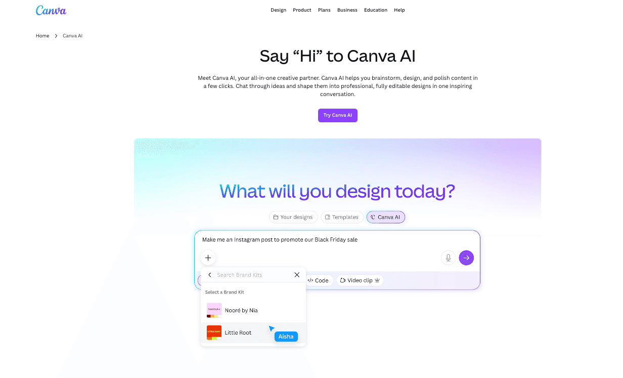
Key features:
AI-driven template generation from uploaded text/documents.
Seamless integration with Canva’s massive asset library.
Real-time multiplayer collaboration.
Pros:
Incredibly easy to use for anyone familiar with Canva.
Unmatched collaboration and sharing features.
Access to millions of stock photos and elements.
Cons:
The AI tends to generate highly generalized layouts rather than structurally nuanced data visuals.
Not ideal for heavy data extraction or complex chart building from PDFs.
Pricing:
Why it stands out:
It is the ultimate generalist tool. If your team already uses Canva, Magic Design is the most frictionless way to generate basic visual summaries.
6. Gamma
Best for: Converting PDFs into slide-style visual summaries and web presentations.
Overview:
While not a traditional "long vertical graphic" tool, Gamma is a breakthrough AI presentation maker. You can upload a PDF, and Gamma will intelligently summarize the document into visually rich, easily digestible slides or scrolling web pages, which often serve the exact same commercial purpose as an infographic.
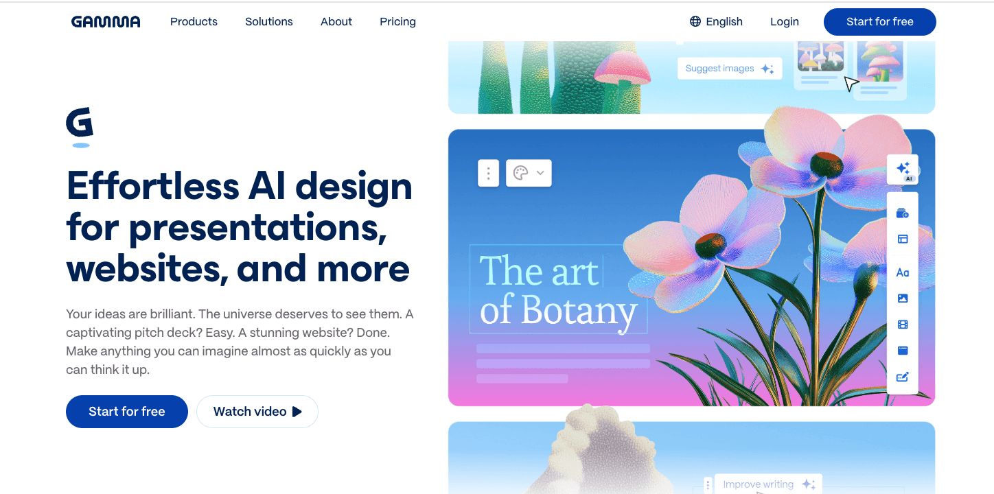
Key features:
One-click PDF to presentation/visual webpage generation.
AI-driven theme and layout swapping.
Embedding options for interactive content.
Pros:
Outstanding AI summarization and structural logic.
Highly responsive designs that look great on mobile and desktop.
Extremely fast document-to-visual workflow.
Cons:
It produces slides/webpages, not traditional PNG/PDF infographics.
Limited manual design control over granular elements.
Pricing:
Free tier available; $9/month.
Why it stands out:
For teams that need presentation-ready outputs rather than static images, Gamma is incredibly fast and visually modern.
7. Infogram
Best for: Heavy data storytelling and dashboard-style infographics.
Overview:
Infogram focuses heavily on numbers. If your PDF is a financial report, a market analysis, or a research paper filled with statistics, Infogram’s AI tools help parse that data and visualize it through highly accurate, often interactive charts integrated into a broader infographic layout.
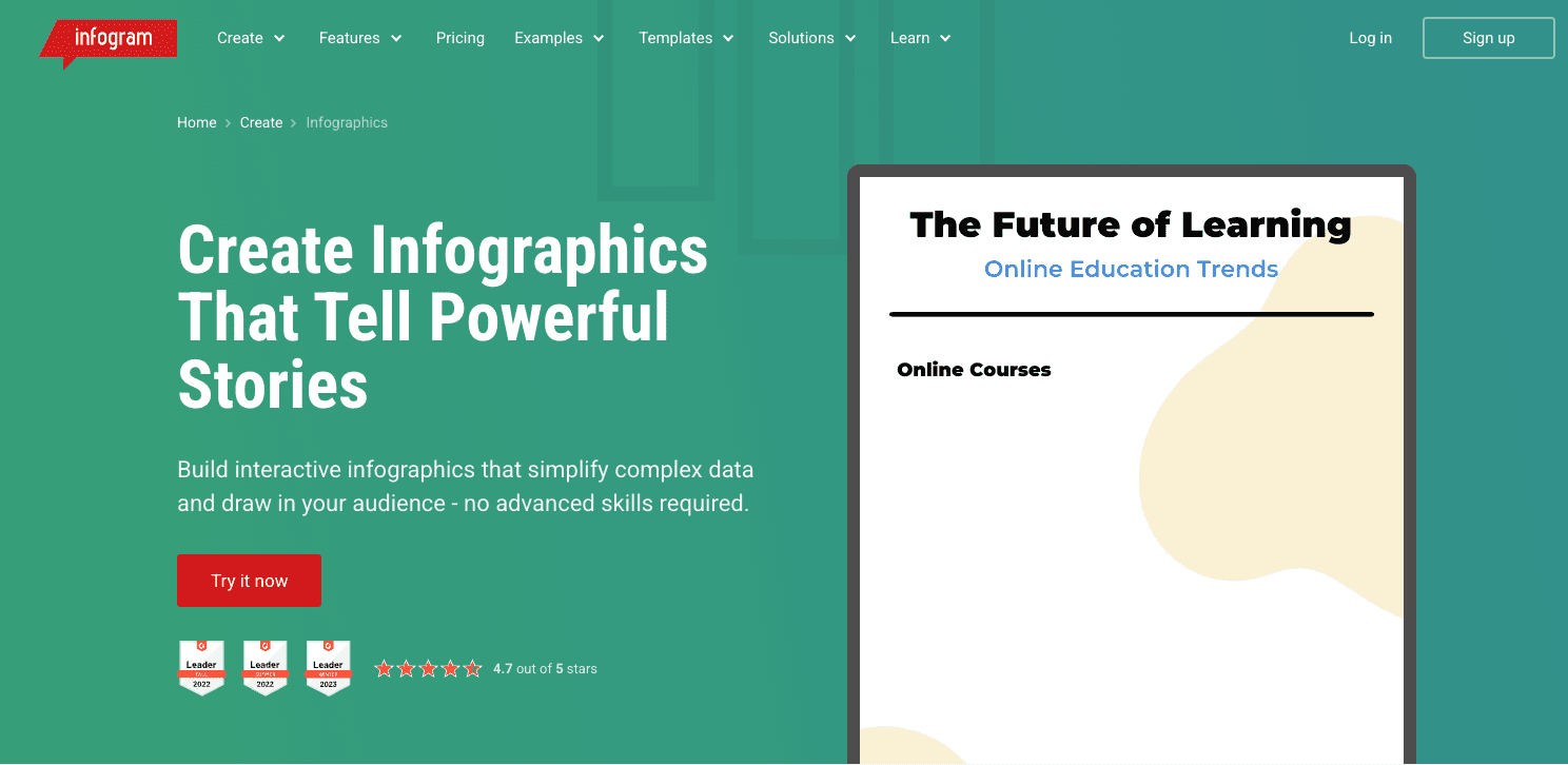
Key features:
Advanced chart and map generation.
Direct data linking (Google Sheets, JSON) alongside AI document extraction.
Responsive dashboard layouts.
Pros:
Best-in-class for numerical data accuracy and chart variety.
Great for market researchers and analysts.
High-quality interactive embeds.
Cons:
The user interface is more complex and data-focused.
Less ideal for purely qualitative text summaries.
Pricing:
Basic free plan; $19/month.
Why it stands out:
It is the go-to tool for turning quantitative PDF reports into verifiable, accurate visual dashboards.
8. Julius AI
Best for: Extracting raw numerical data from PDFs to generate standalone analytical charts.
Overview:
Julius AI is primarily an AI data analyst. While it doesn't output traditional, heavily styled marketing infographics, it is exceptional at reading a PDF, understanding the underlying data, running analysis, and outputting clean, accurate charts that can be dropped into reports.
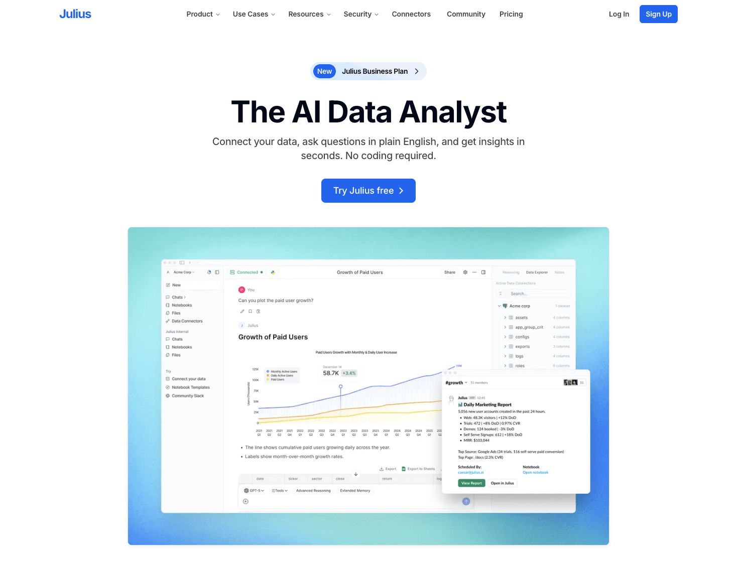
Key features:
Advanced OCR and data parsing from PDF tables.
Natural language querying (e.g., "Create a bar chart showing Q3 revenue from this PDF").
Python-backed data processing.
Pros:
Unrivaled accuracy for deep data extraction.
Can perform mathematical analysis on the PDF data before charting.
Perfect for technical and financial users.
Cons:
Does not generate full infographic layouts or text summaries.
Requires the user to build the final presentation in another tool.
Pricing:
Free basic usage; $33/month.
Why it stands out:
For purely analytical charting from complex PDF documents, Julius AI handles the heavy mathematical lifting that standard design tools fail at.
9. Napkin AI
Best for: Rapidly converting document text into quick, conceptual visual diagrams.
Overview:
Napkin AI is a unique tool that bridges text and visuals. By pasting text from a PDF or uploading document sections, the AI instantly suggests flowcharts, Venn diagrams, and conceptual graphics alongside the text. It is a fantastic adjacent alternative to full infographics.
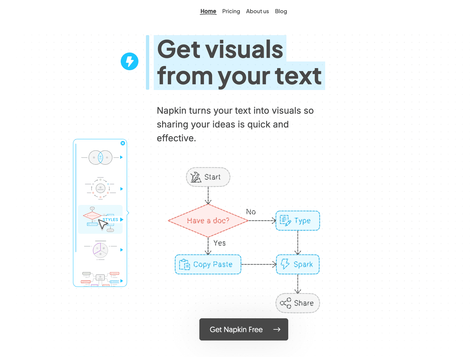
Key features:
Real-time text-to-diagram generation.
Auto-adjusting visual frameworks.
Clean, sketch-like or corporate visual styles.
Pros:
Incredibly fast for visualizing concepts and frameworks.
Excellent for strategy documents and operational manuals.
Very low barrier to entry.
Cons:
Cannot generate a complete, multi-section infographic in one click.
Limited customization for specific brand guidelines.
Pricing:
Why it stands out:
It excels at micro-visualizations—perfect for turning a dense page of PDF text into a clear, understandable diagram instantly.
10. EdrawMind AI
Best for: Turning PDF research into visual mind maps and structural outlines.
Overview:
Sometimes, an infographic needs to map out a system or a hierarchy. EdrawMind’s AI features allow users to upload dense PDFs and automatically generate comprehensive mind maps, which serve as excellent visual summaries for complex research.
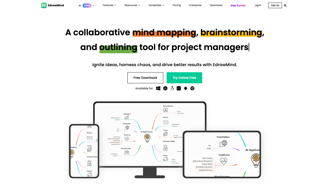
Key features:
PDF-to-Mind-Map generation.
AI outline structuring and summarization.
Export to multiple visual formats including PPT and PDF.
Pros:
Best way to visualize the structure of a long document.
Great for students, researchers, and project managers.
Highly editable nodes and branches.
Cons:
Limited to mind map and flowchart structures; not a traditional infographic tool.
Visually simpler than tools like Visme or Canva.
Pricing:
Why it stands out:
When the goal is to understand how ideas in a PDF connect, an AI mind map is often a more effective visual summary than a standard infographic.
Best AI Infographic Generators from PDF by Use Case
To help you narrow down your choices based on search intent and workflow, here are the best tools categorized by specific scenarios:
Best for business reporting: Powerdrill Bloom. It perfectly balances the need for accurate insight extraction with clean, business-ready layouts without requiring graphic design skills.
Best for marketers: Visme AI. Marketers need premium, brand-aligned aesthetics, and Visme’s high-fidelity interactive templates deliver the best visual impact.
Best for research summaries: Infogram. Researchers handling heavy data sets will benefit from Infogram’s robust charting capabilities and statistical accuracy.
Best for presentations and PPT-ready output: Gamma (or Powerdrill Bloom for analysis-heavy decks). Gamma’s fast slide generation is unbeatable for turning documents into pitch decks.
Best for beginners: Canva Magic Design. If you have zero design experience, Canva’s intuitive drag-and-drop interface is the easiest place to start.
Best free / budget-conscious option: Piktochart AI and Napkin AI both offer highly usable free tiers that allow you to generate visual summaries without immediate paywalls.
Can AI Really Turn a PDF into an Infographic?
Yes, but the quality of the output heavily depends on the tool you use and the type of PDF you upload.
AI excels at "extraction and scaffolding"—meaning it can rapidly pull the most important statistics, identify the core narrative, and place that content into a visual framework. For business reports, research summaries, and marketing reports, this capability is incredibly valuable because it bypasses hours of manual reading and formatting.
However, there are practical limitations. If your PDF is a poorly scanned image with unstructured data, the AI will struggle to read it. Furthermore, AI cannot currently replace a senior graphic designer when it comes to highly custom, brand-bespoke illustrative artwork. The real value of an AI infographic generator lies in producing presentation-ready, structurally sound visual summaries rapidly, rather than creating award-winning artistic masterpieces.
How to Choose the Right PDF-to-Infographic AI Tool
When evaluating software for your team, look past the marketing hype and consider the following buyer-oriented criteria:
PDF Ingestion Quality: Does the tool reliably read complex PDFs, including tables and multi-column layouts, or does it only work with plain text?
Analysis vs. Layout: Does the tool actually summarize and extract insights (like Powerdrill Bloom), or does it just randomly drop your text into pre-made design boxes (like basic design apps)?
Chart Generation: If your PDFs contain numbers, can the AI automatically generate accurate pie charts, bar graphs, and line charts based on that data?
Export Flexibility: Are you locked into the platform, or can you export the visual summary to PNG, PDF, or editable PPT/Slides for business sharing?
Workflow Fit & Scalability: Does the tool require a steep learning curve, or can non-designers on your operations and strategy teams use it immediately? Check if the pricing scales well as your team’s usage grows.
Free Tools, Templates, and Adjacent Alternatives
If you are not ready to commit to a paid SaaS subscription, there are several ways to explore this technology. Many tools like Powerdrill Bloom, Canva, Piktochart, and Venngage offer free plans that provide access to basic templates, though they often restrict PDF upload sizes or brand customizability.
It is also worth considering whether you need a traditional infographic or an adjacent alternative. For instance:
PDF to PPT: If your real goal is to present the document in a meeting, an AI presentation maker (like Gamma) or an insight-to-slide tool (like Powerdrill Bloom) will be much more effective than a static vertical graphic.
AI Chart Generation: If you only need to visualize specific data points for a report, analytical tools like Julius AI are better suited than general design software.
General Design vs. AI-Native: General design tools (Canva) have AI bolted on, making them great for templates but weak on document logic. AI-native tools are built specifically to handle document logic, making them vastly superior for complex visual summaries.
Final Verdict
In 2026, the workflow of turning dense documents into visual summaries has fundamentally shifted. You no longer need to manually copy text from a PDF to build an infographic.
For general design tasks and basic layouts, traditional giants like Canva and Venngage remain safe bets. For highly interactive, premium marketing assets, Visme is the top choice. However, the most significant trend this year is the rise of tools that handle the entire analytical workflow.
If your goal is to extract real insights from business reports and automatically transform them into accurate charts and presentation-ready visuals, Powerdrill Bloom stands out as an exceptionally strong, best-fit choice for business and marketing teams. Ultimately, the best tool is the one that aligns with your specific output needs—whether that is a quick visual diagram, a data-heavy dashboard, or an executive slide deck.
Frequently Asked Questions
Can AI turn a PDF into an infographic?
Yes. AI tools can analyze the text and data within a PDF, summarize the key points, and automatically map that information into a visual layout, chart, or infographic template.
What is the best AI infographic generator from PDF?
The "best" tool depends on your needs. Visme is best for premium designs, Powerdrill Bloom is best for insight extraction and presentation-ready business visuals, and Canva is best for team collaboration and beginners.
Are there any free AI tools to turn PDF into infographic?
Yes, tools like Powerdrill Bloom, Canva, Piktochart, and Napkin AI offer free tiers. However, free plans usually come with limitations on PDF file size, export formats, or the number of AI generations per month.
Should I use a PDF to PPT tool or a PDF to infographic tool?
Choose PDF to PPT (like Gamma or Powerdrill Bloom) if you need to present the information to stakeholders in a meeting. Choose PDF to infographic if you are creating a standalone asset for a blog post, email newsletter, or poster.
Which tool is best for business reports and presentation-ready infographics?
Powerdrill Bloom is highly recommended for business reports because it excels at bridging data analysis, accurate charting, and logical narrative structuring, outputting assets that are ready for executive review.
Which AI tool is best for turning research PDFs into visuals?
For quantitative research with heavy statistics, Infogram or Julius AI are best for accuracy. For qualitative research, EdrawMind AI (for mind maps) or Piktochart (for text summaries) work exceptionally well.
What features should I look for in a PDF-to-infographic AI tool?
Look for high-quality document ingestion (ability to read tables and formats correctly), accurate AI summarization, native chart generation, and the ability to export to formats that fit your workflow (PNG, PDF, PPT).
Are these AI tools good for non-designers?
Absolutely. The primary benefit of these AI tools is that they remove the barrier of graphic design skills, allowing marketers, analysts, and founders to generate professional visual summaries simply by uploading a document.